J•App
A Japanese restaurant mobile (iOS) app design
About the project
Duration: 5 months (Oct – Nov. 2023)
- Role - UX/UI Designer.
- Tools - Figma, Illustrator, ProCreate.
Challenges:
- Ordering Japanese cuisine can be confusing when faced with mysterious, authentic dish names or unfamiliar ingredients.
- Expecting one thing based on a quick Google search but receiving something entirely different can lead to surprises.
- Uncertainty about what to expect may even discourage trying Japanese food altogether, pushing diners to opt for the familiar comfort of a burger instead.
Results:
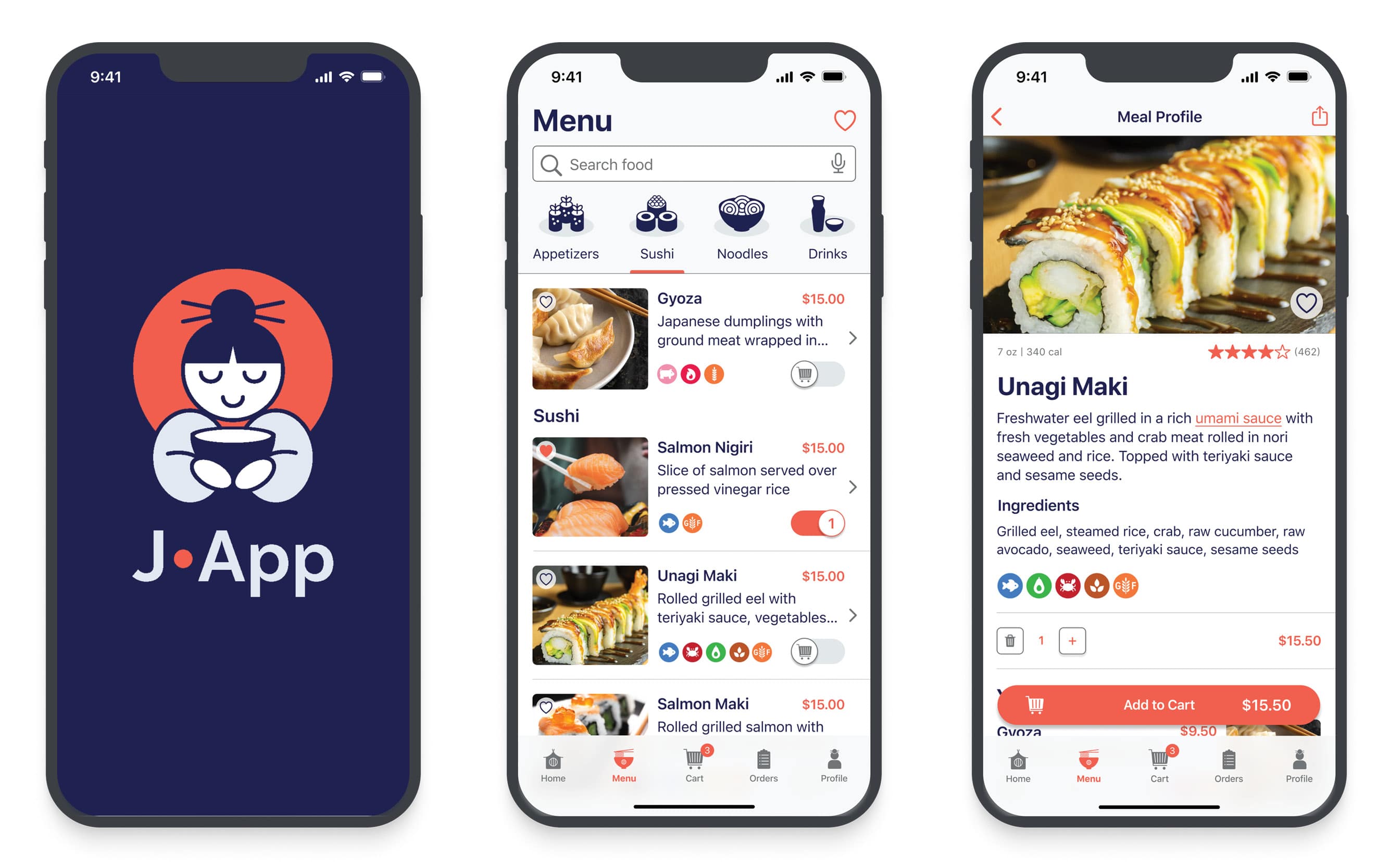
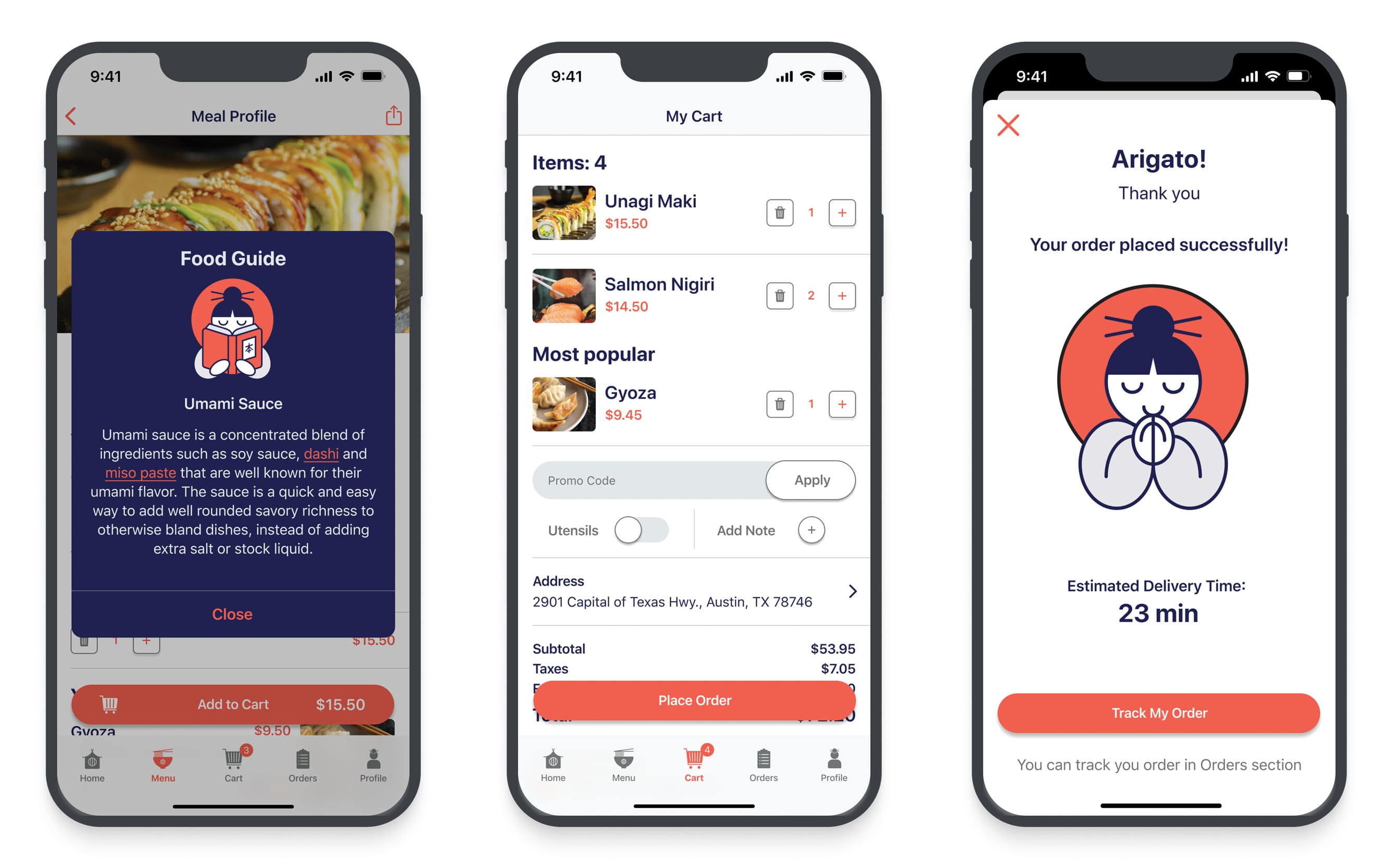
- “Food Guide” screen is a gem of the J•App that includes description about a dish or ingredient. This screen prevents the user from needing to leave the app in order to google information about the food.
- High-quality photos, detailed description which includes the way of cooking and full list of ingredients save users from any confusion.
- Icons showing allergens, types of meat, spiciness levels save users from any surprises and add smoothness to the user experience.
Steps
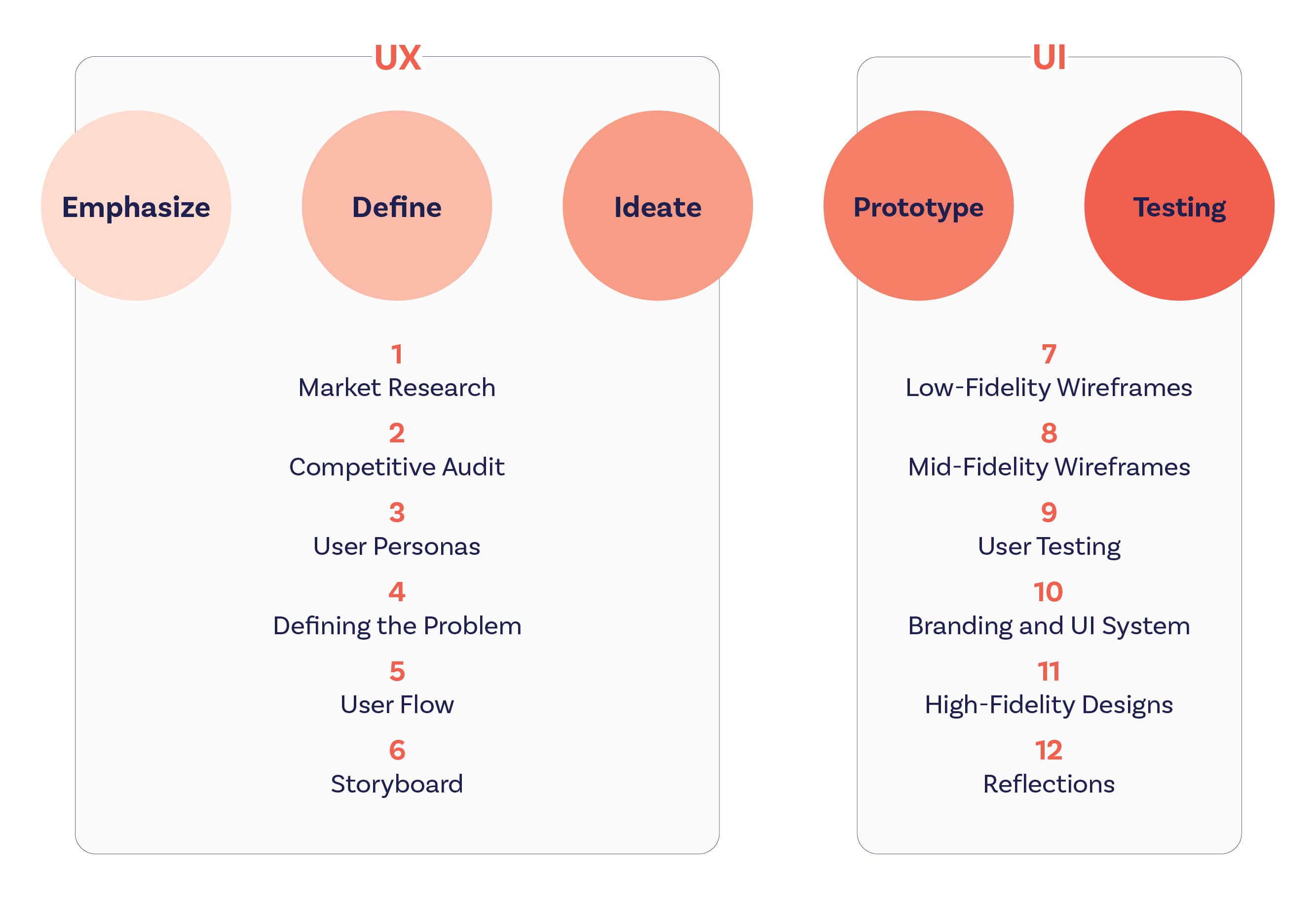
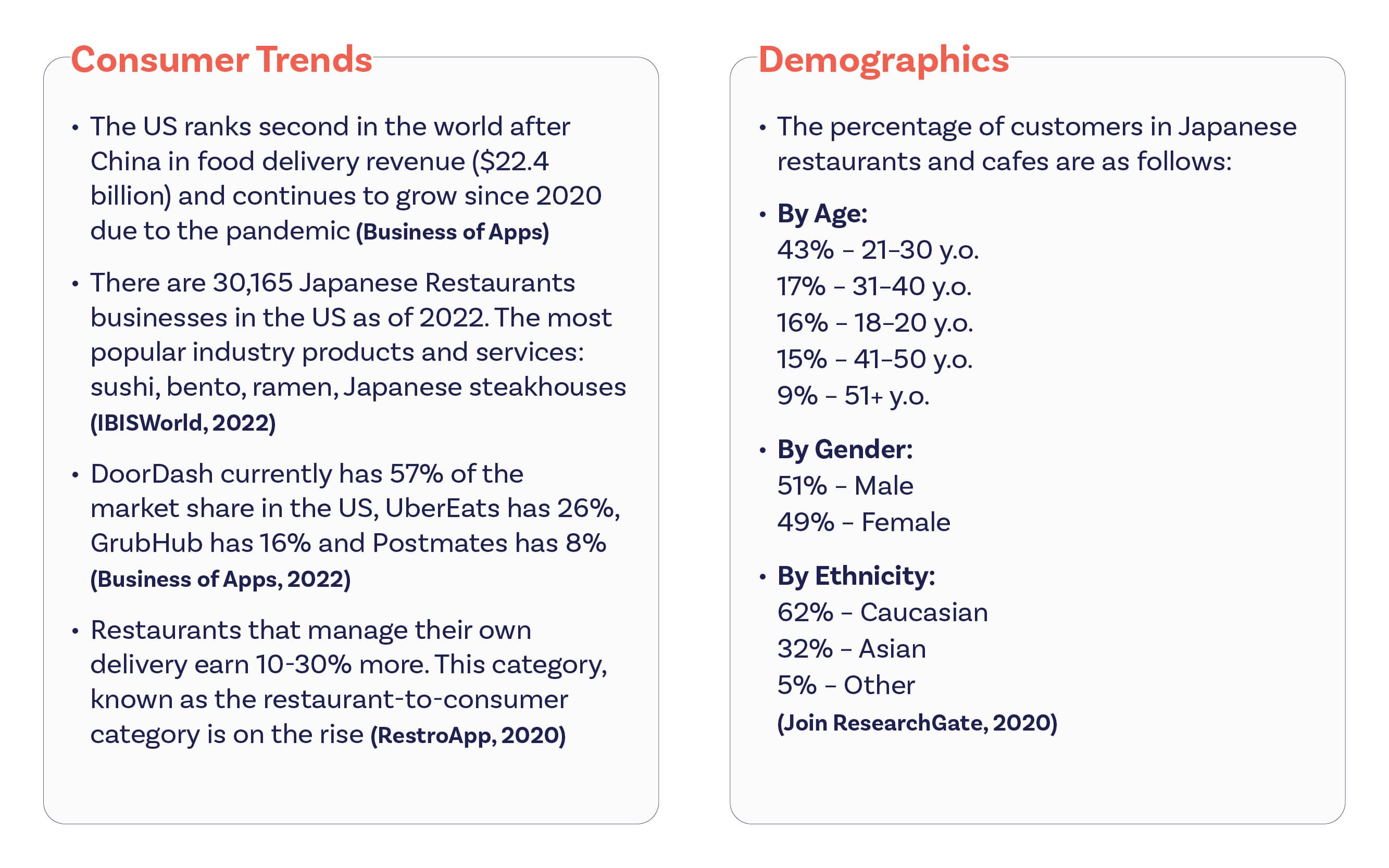
1. Market research
I began with some secondary research to gain a better understanding of the market. As a result of market research, some of my assumptions have changed such as: the age or gender of the target audience. Here are some of the key ideas I discovered:
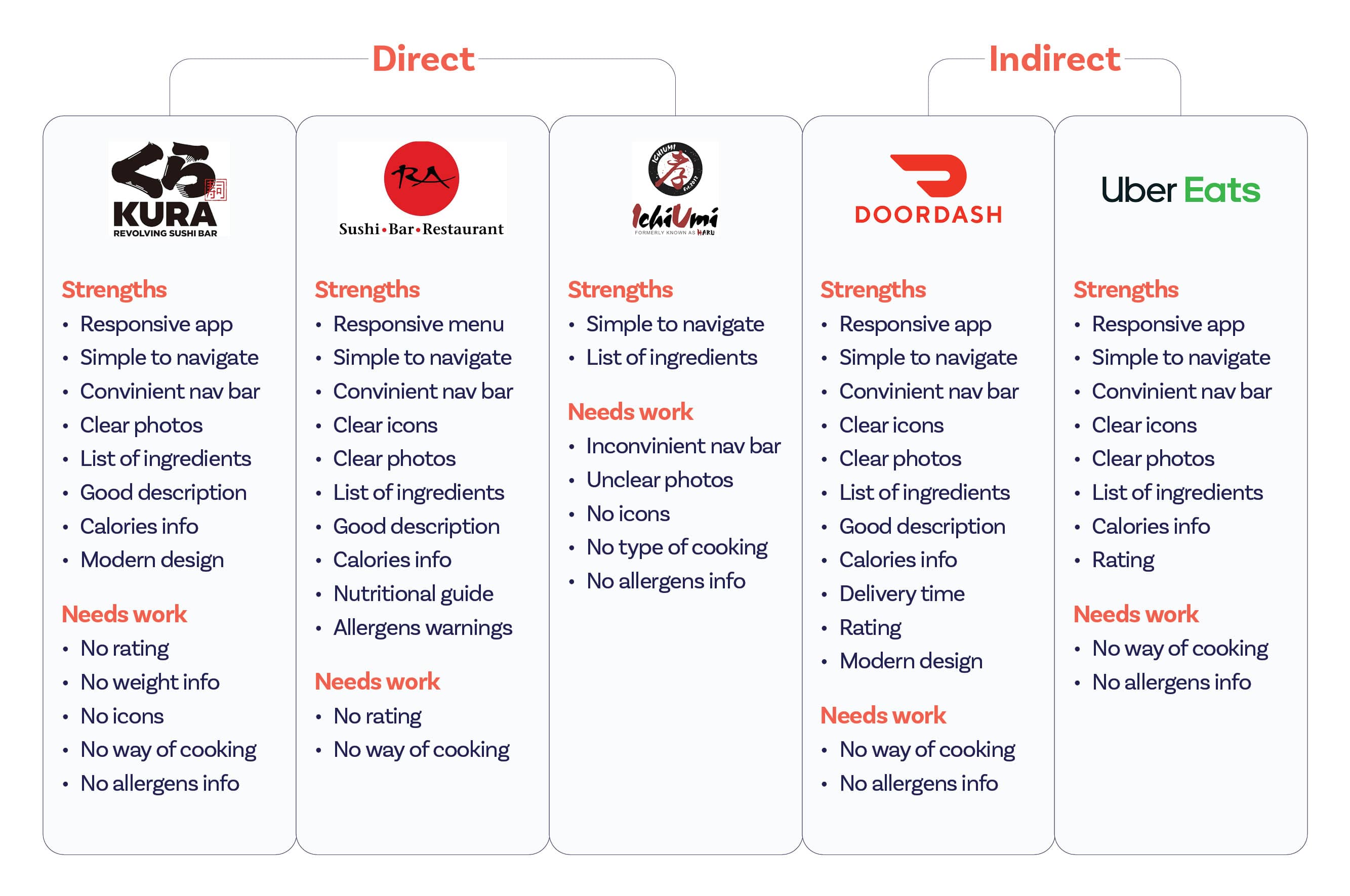
2. Competitive Audit
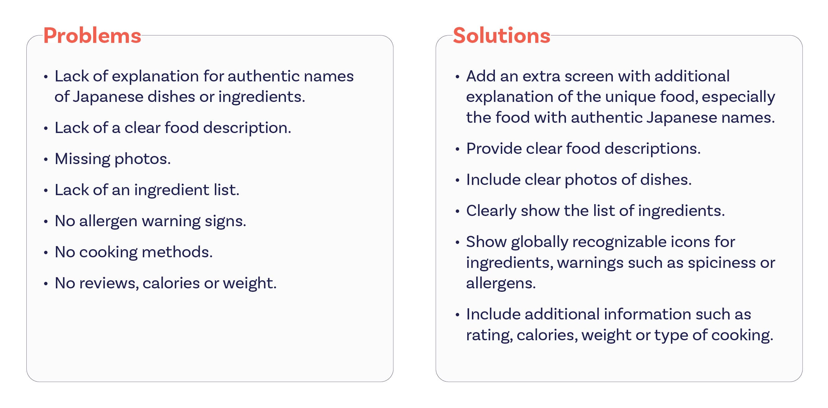
Through Yelp I identified my direct competitors in Austin by comparing the price category, location, services and the way of operating. Also, through my market research I identified some top indirect competitors like Doordash and UberEats. Some opportunities I detected for my App:
- Include an information screen describing unknown or authentic Japanese food names and ingredients.
- Show globally recognizable icons for ingredients, warnings such as spiciness or allergens.
- Demonstrate not only the name but also photos of the dishes. Include additional information such as calories, weight or type of cooking.
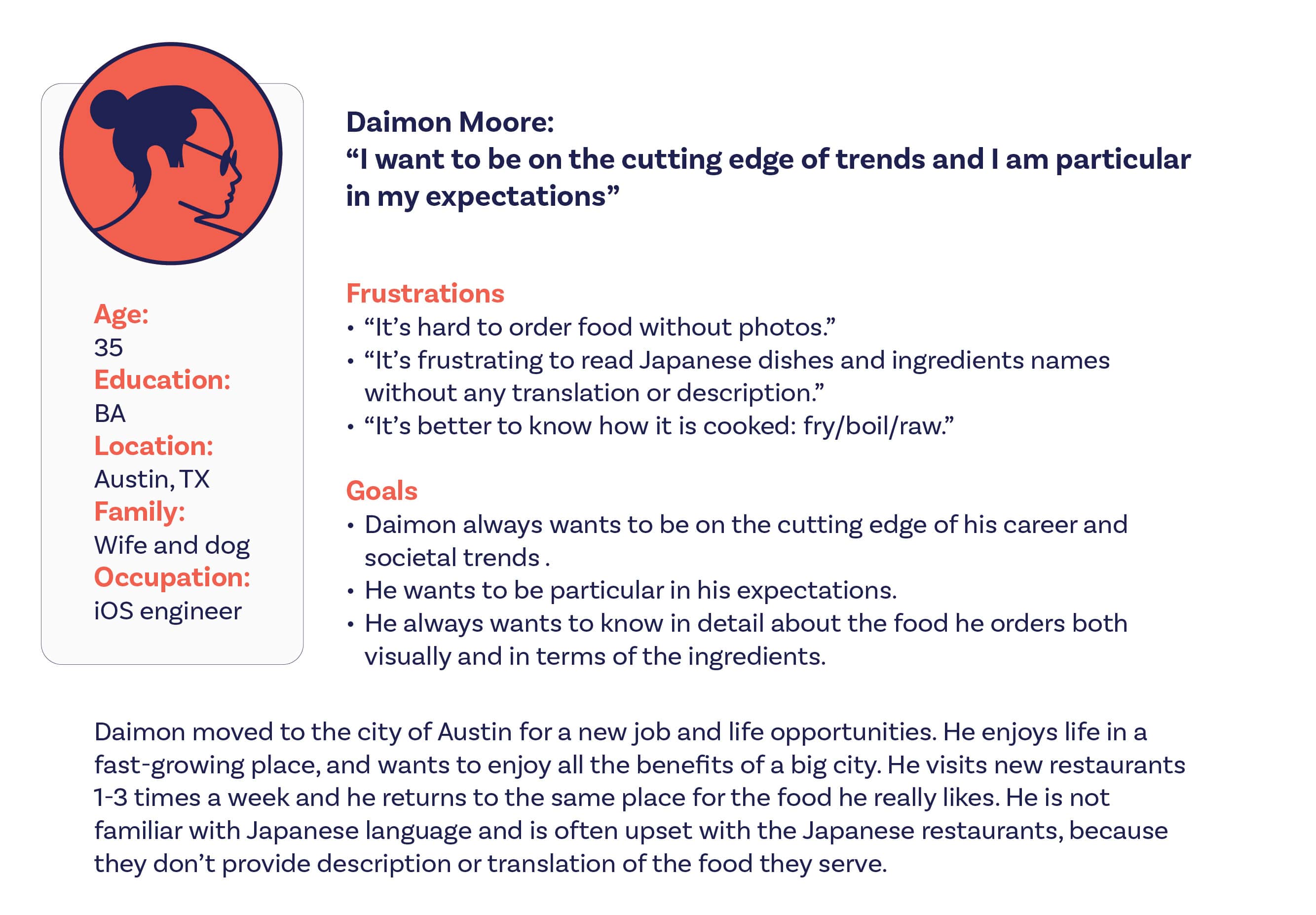
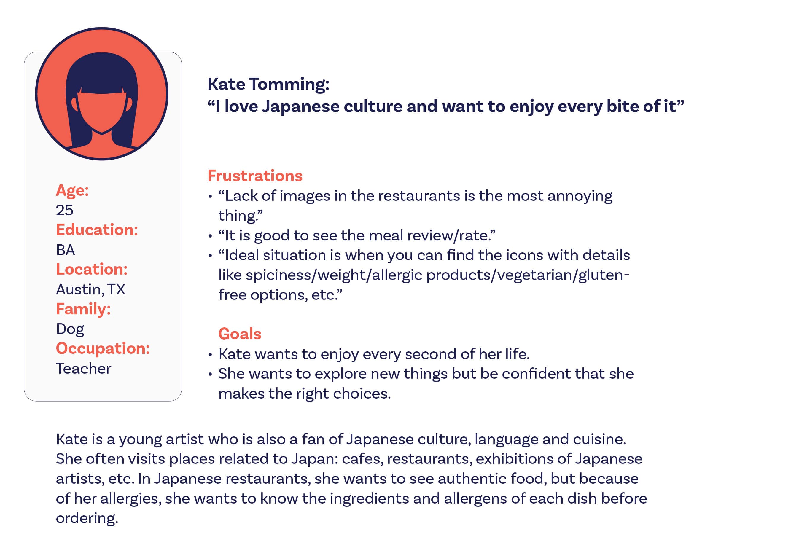
3. User Personas
To start getting an idea of who J•App users are, I used everything that I have learned so far from my secondary research to create personas. I conducted interviews with people whom I know personally to learn more about the different experiences they have had with choosing and ordering Japanese food. I wanted to understand common goals, motivations, challenges and frustrations people face through the whole process of ordering Japanese food.
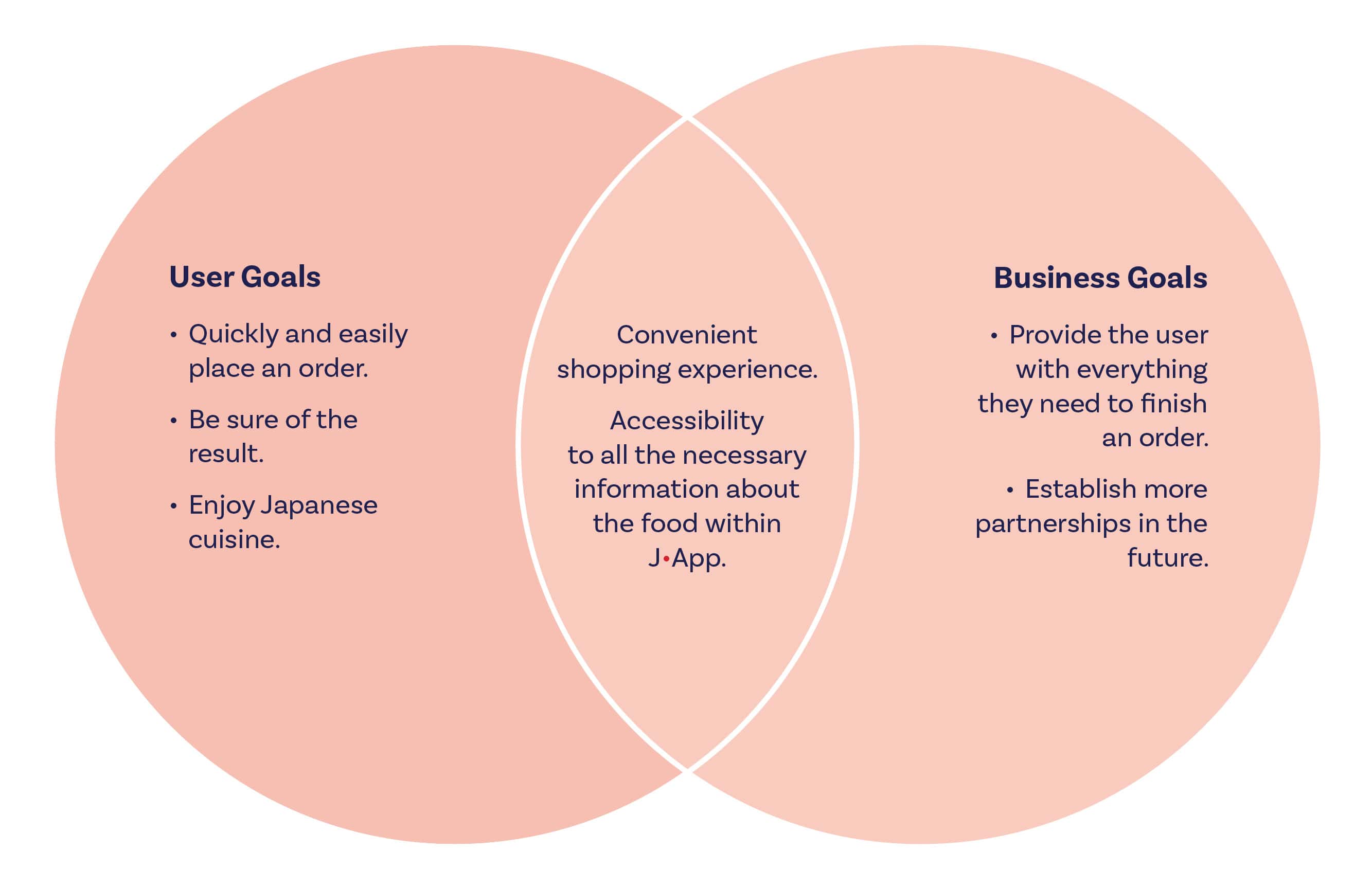
4. Defining the Problems
After market and user research, I started to define project goals to get a clear understanding of what J•App is trying to achieve and where the business and user goals align to provide a right solution for the users’ problems.
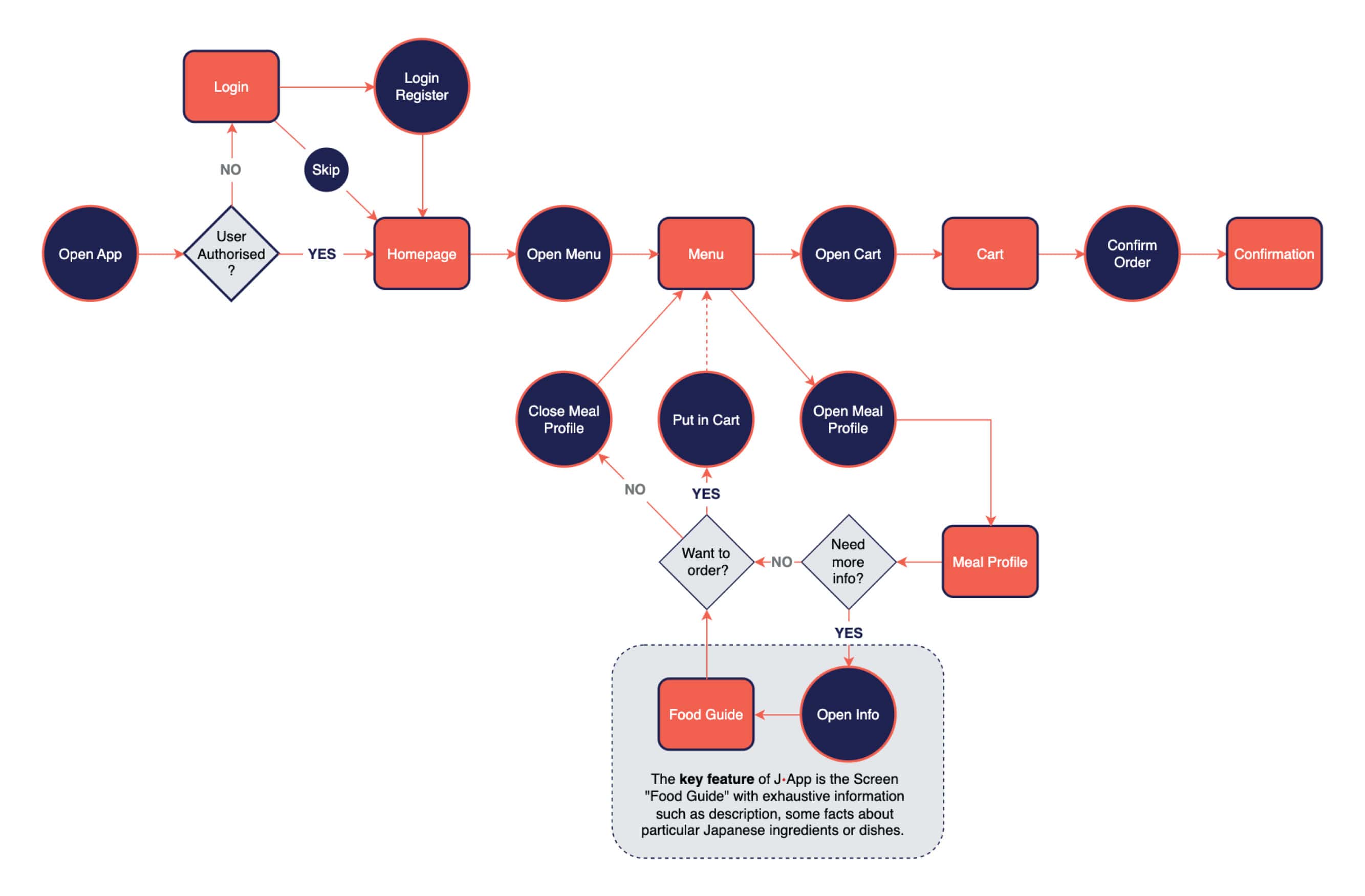
5. User Flow
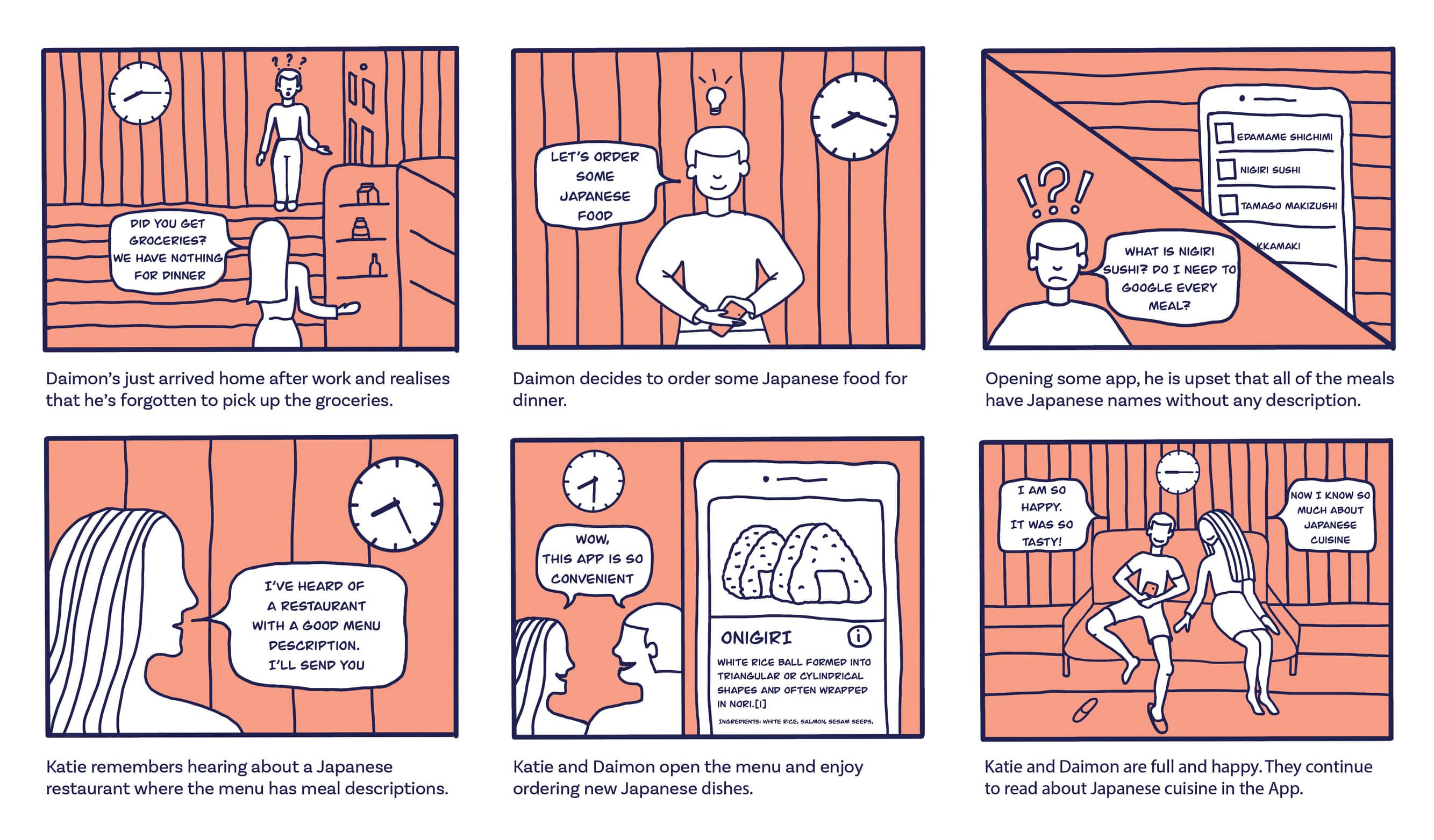
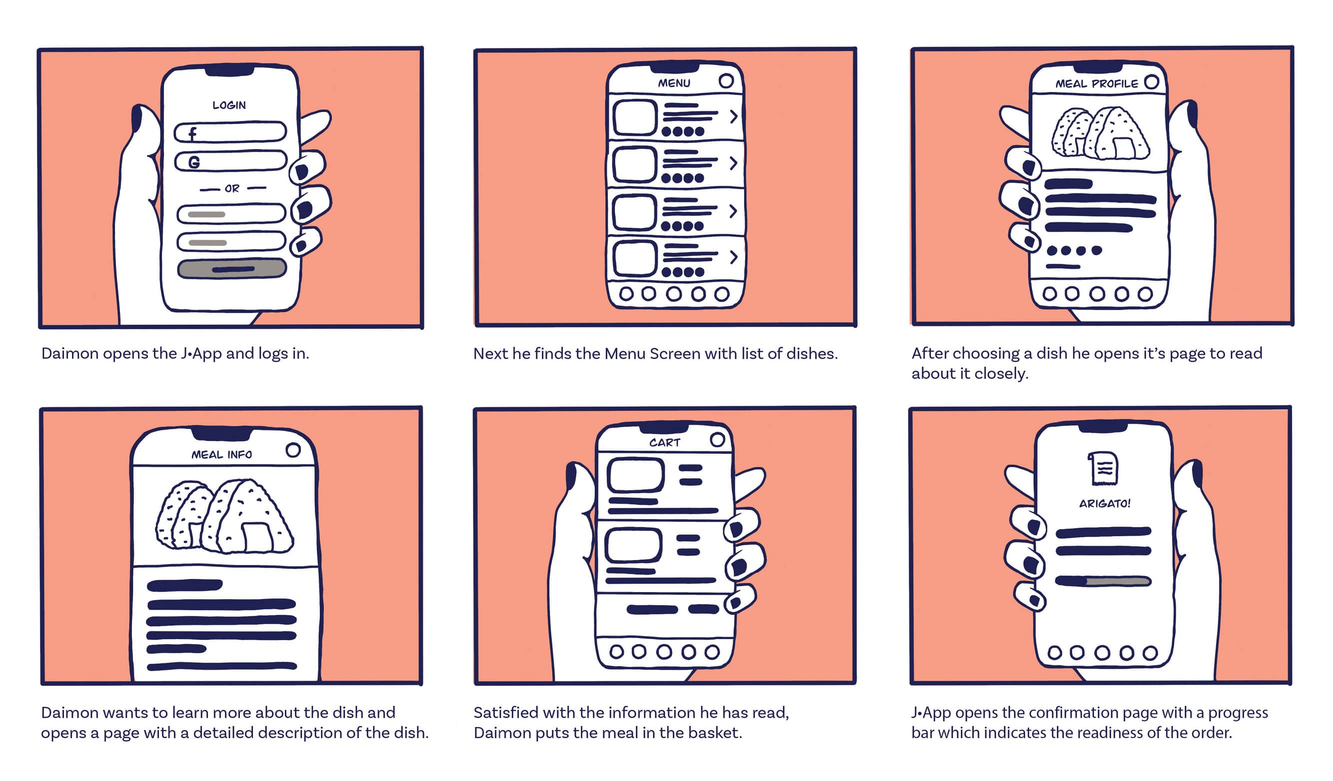
6. Storyboards
Scenario: The Japanese Restaurant App that has additional information like meal or ingredients description.
Big-picture Storyboard
Close-up Storyboard
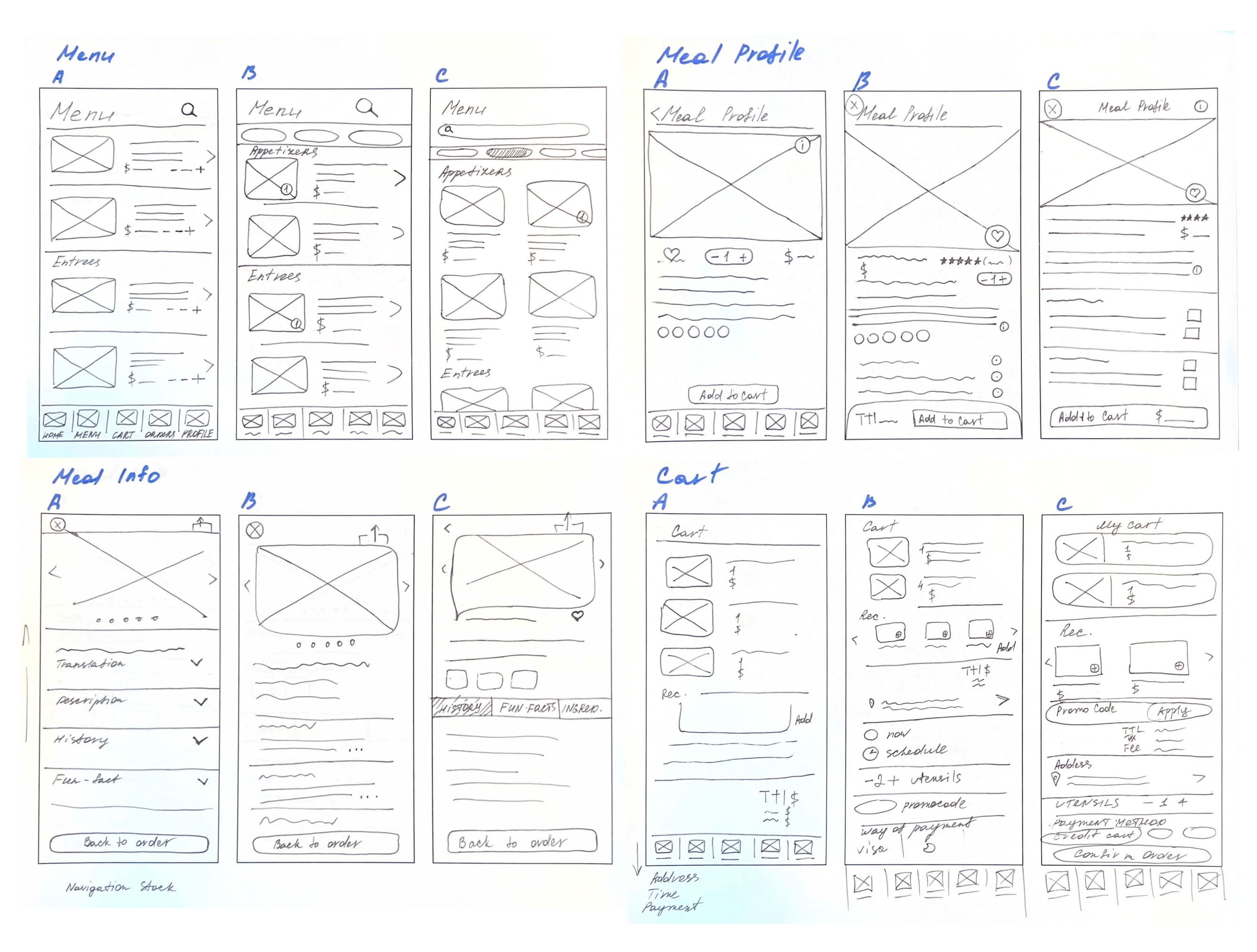
7. Low-Fidelity Wireframes
Using my understanding of the user and my goals for the app, I worked on making informed decisions on how to design J•App’s screens by sketching low-fidelity wireframes.
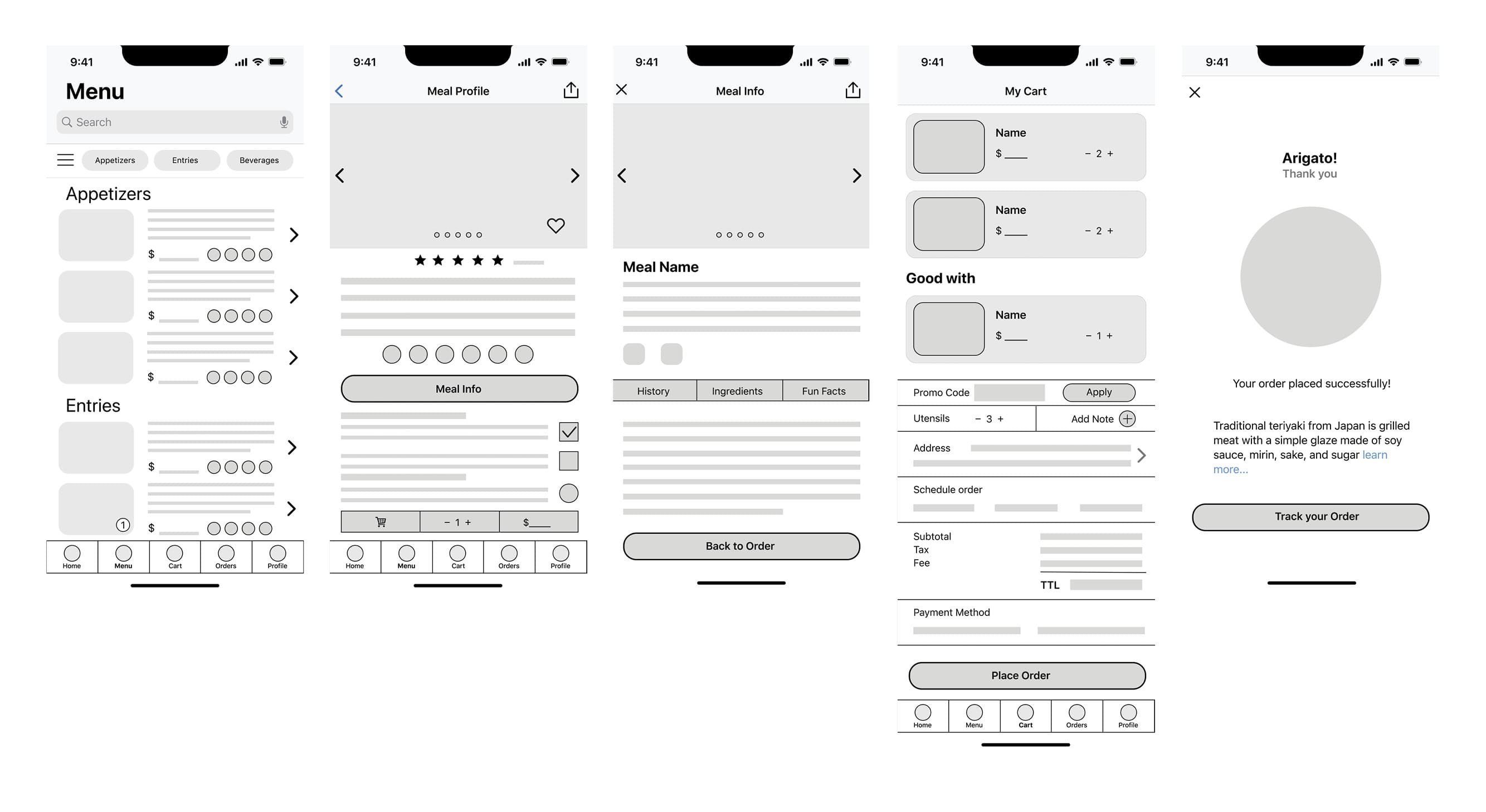
8. Mid-Fidelity Wireframes
After I sketched out my ideas, I wanted to test the decisions I made and make sure that the structure and flow of the app is intuitive for users. Before working on the visual design, I wanted to first make sure that the design was functional. In order to do this, I decided to create a mid-fidelity prototype which would help me quickly test the design on real users and make any priority revisions before integrating the branding and visual design.
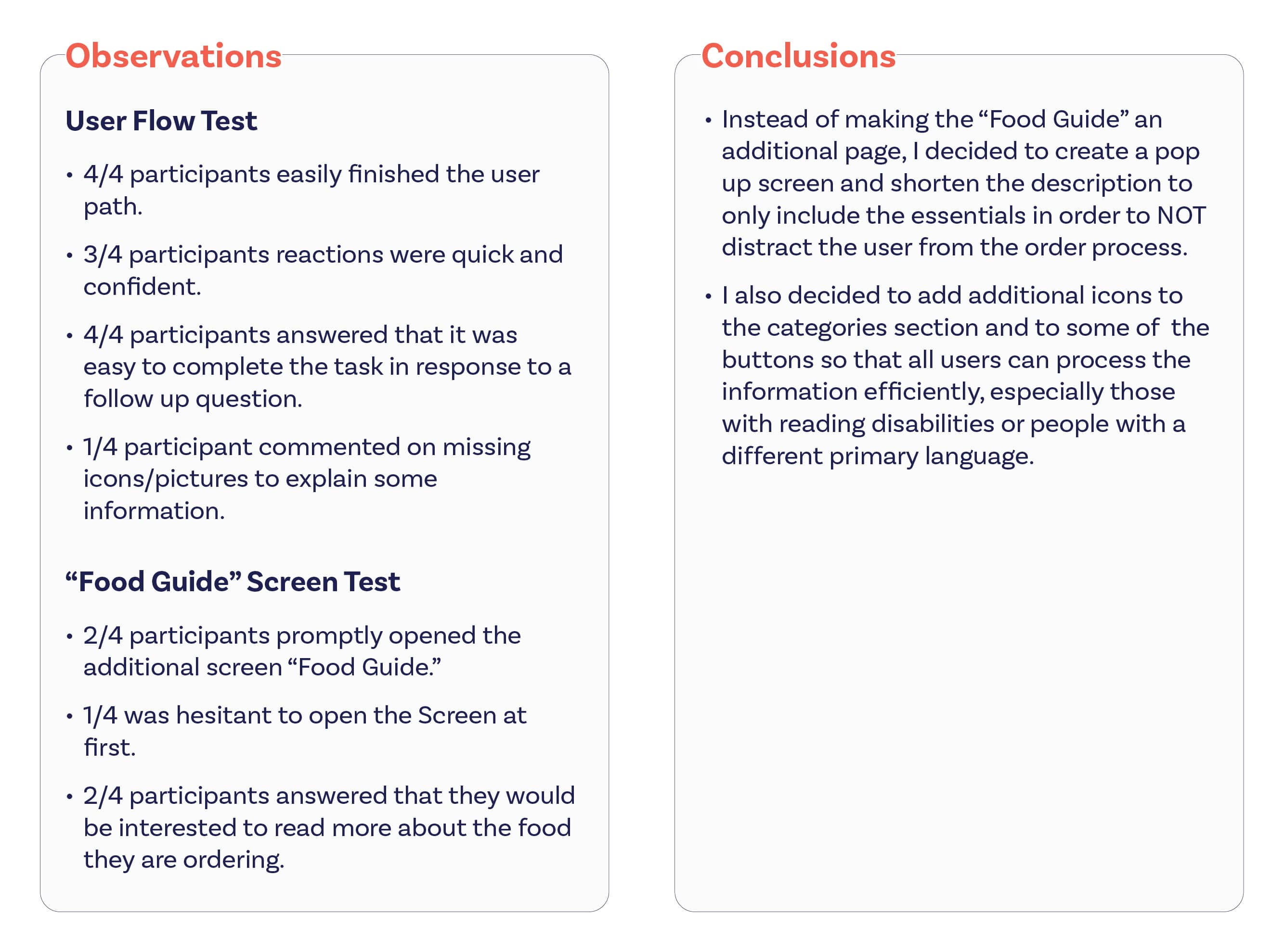
9. Usability Study
After sketching mid-fidelity prototypes, I firstly wanted to test the necessity and convinience of an additional screen “Food Guide” which contains a full description of the dish or ingredient, which I considered as a key element of the J•App. Secondly, I wanted to test the decisions I made and make sure that the structure and flow of the app is intuitive for users.
Before working on the visual design, I wanted to first make sure that the design was functional. In order to do this, I decided to make a usability study.
Method: Clicks on prototype Participants: 4 users (one of the users isn’t fluent in English) Average time: 3 minutes Overall, the testing showed positive results, but there were distinct areas where users faced questions and difficulties.
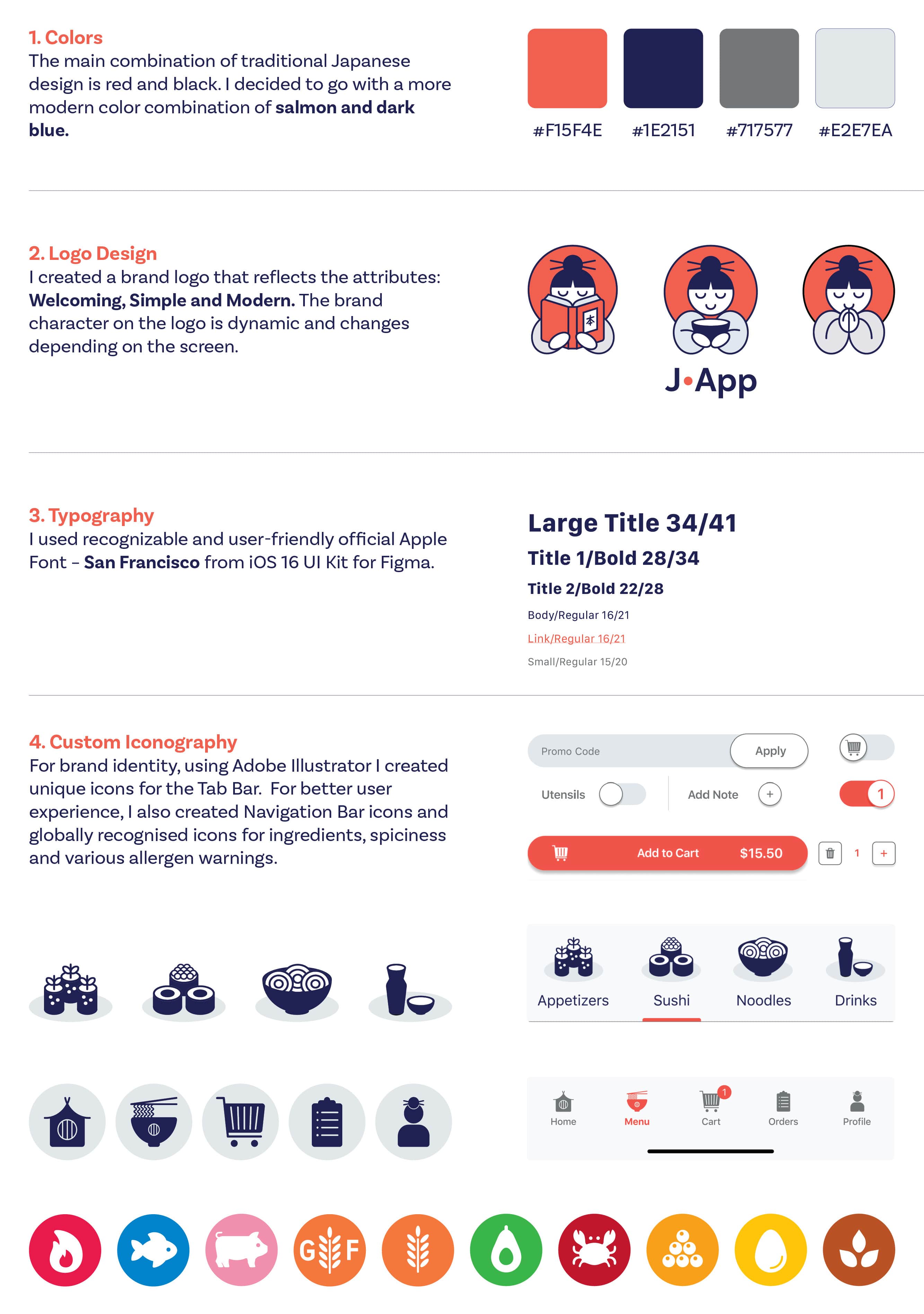
10. Branding and UI System
After making the revisions to my design to improve it’s usability, I now wanted to think about how I would convey J•App brand visually. J•App’s branding reflects the attributes: Welcoming, Simple and Modern and I worked on setting the visual direction of it’s branding to convey its unique identity.
11. High-Fidelity Designs
Taking my revised wireframes, I then worked on creating final mockups and created a final prototype. With the help of the conducted research, I was able to identify all the elements necessary for the process of convenient ordering of Japanese food by any user:
- Dishes have a clear photo, name, description, calories, weight and list of ingredients.
- In addition, each dish contains icons by which you can immediately identify the ingredients, including allergens.
- All buttons contain icons in addition to text.
- The most important difference of this app is the presence of a Food Guide screen with a description of all the unique dishes and ingredients of Japanese cuisine.