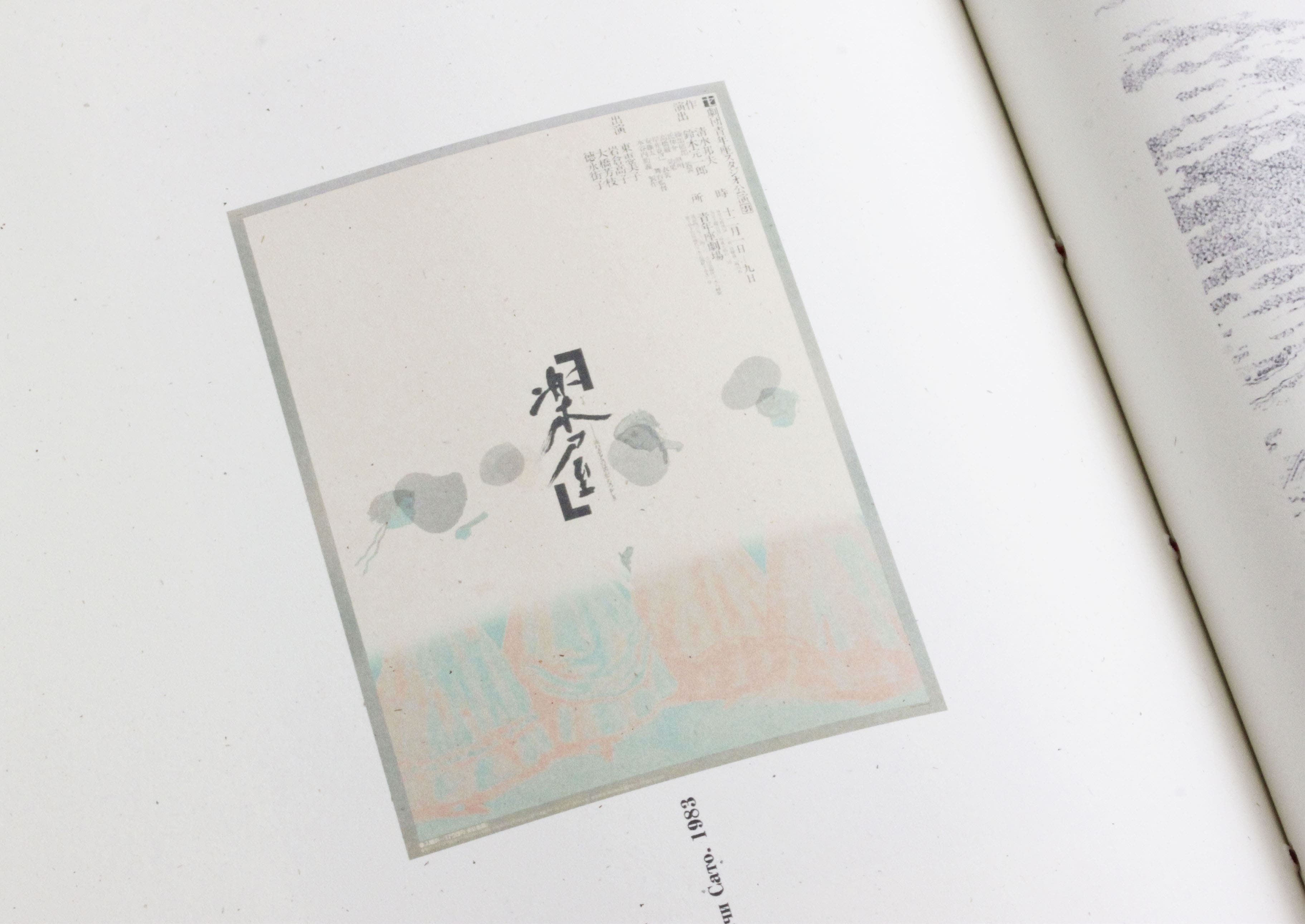
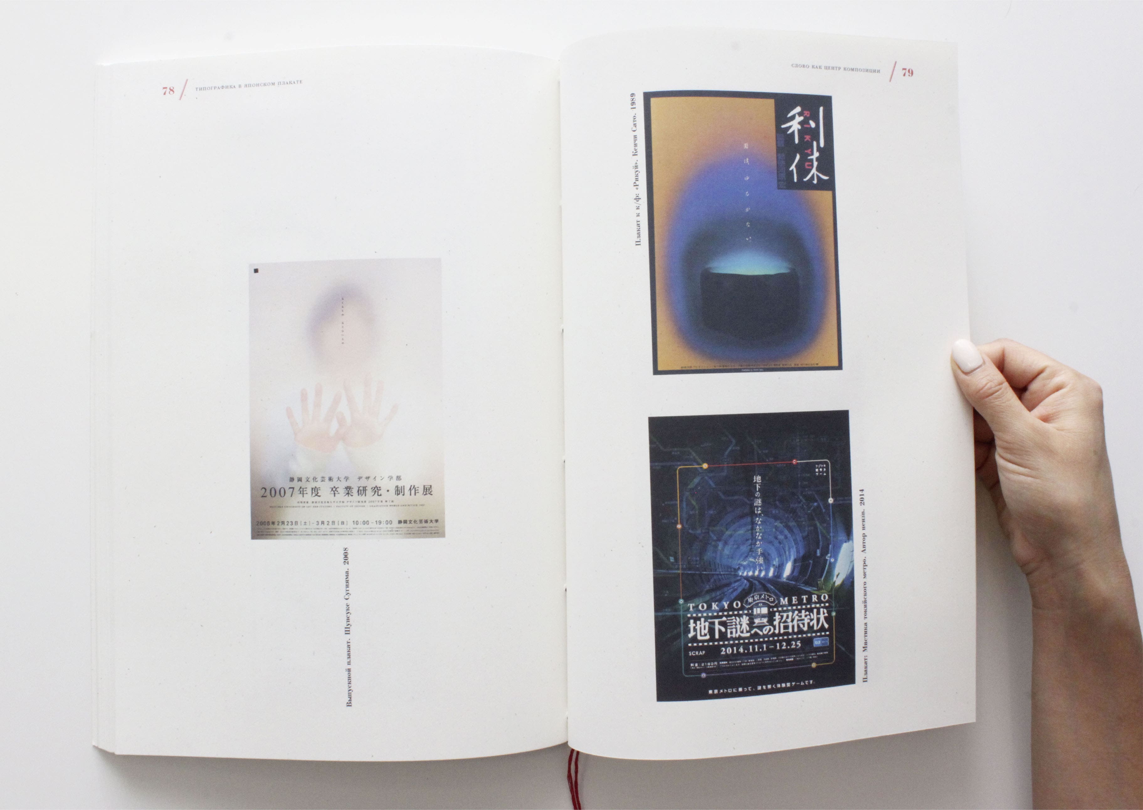
Typography in Japanese Posters
A visual journey: research and design
About the Project
Duration: 1 year
- Role - Researcher, author, graphic designer.
- Tools - Photoshop, InDesign.
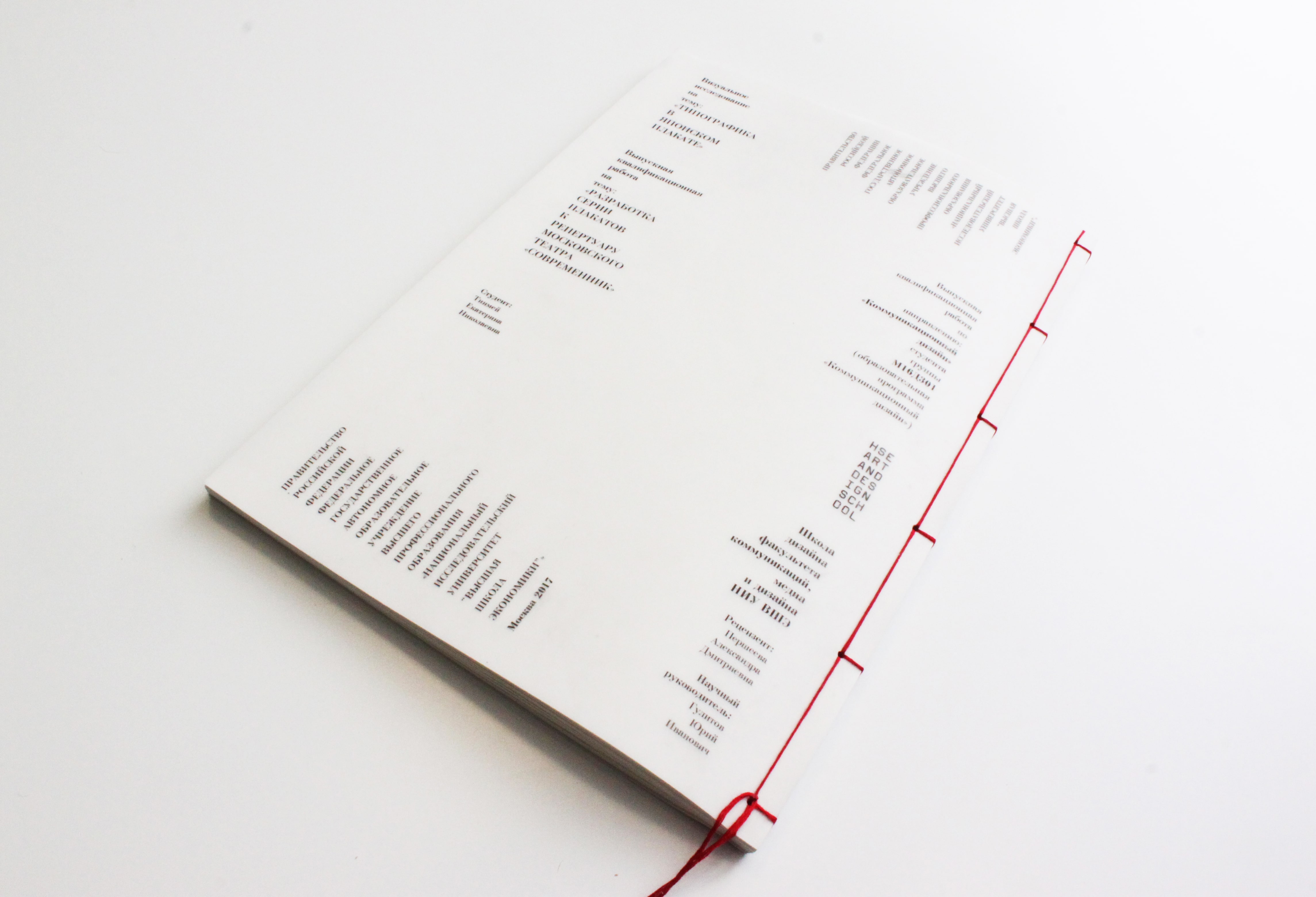
This project was my graduation work for the Master’s program in Communication Design at the HSE School of Art and Design (2019). I chose this topic because I’ve always been fascinated by the success and unique appeal of Japanese design. While I understood the significance of illustrations and vibrant colors, I believed typography was the core element that made Japanese design stand out. Having some knowledge of the Japanese language, I saw more than just beautiful scribbles in their typography. Yet, having never lived in Japan, Japanese design remained intriguing and unfamiliar to me—a perfect subject for exploration.
Results
Over the course of a year, I conducted a comprehensive visual study of typography in Japanese posters. The outcomes of this research included:
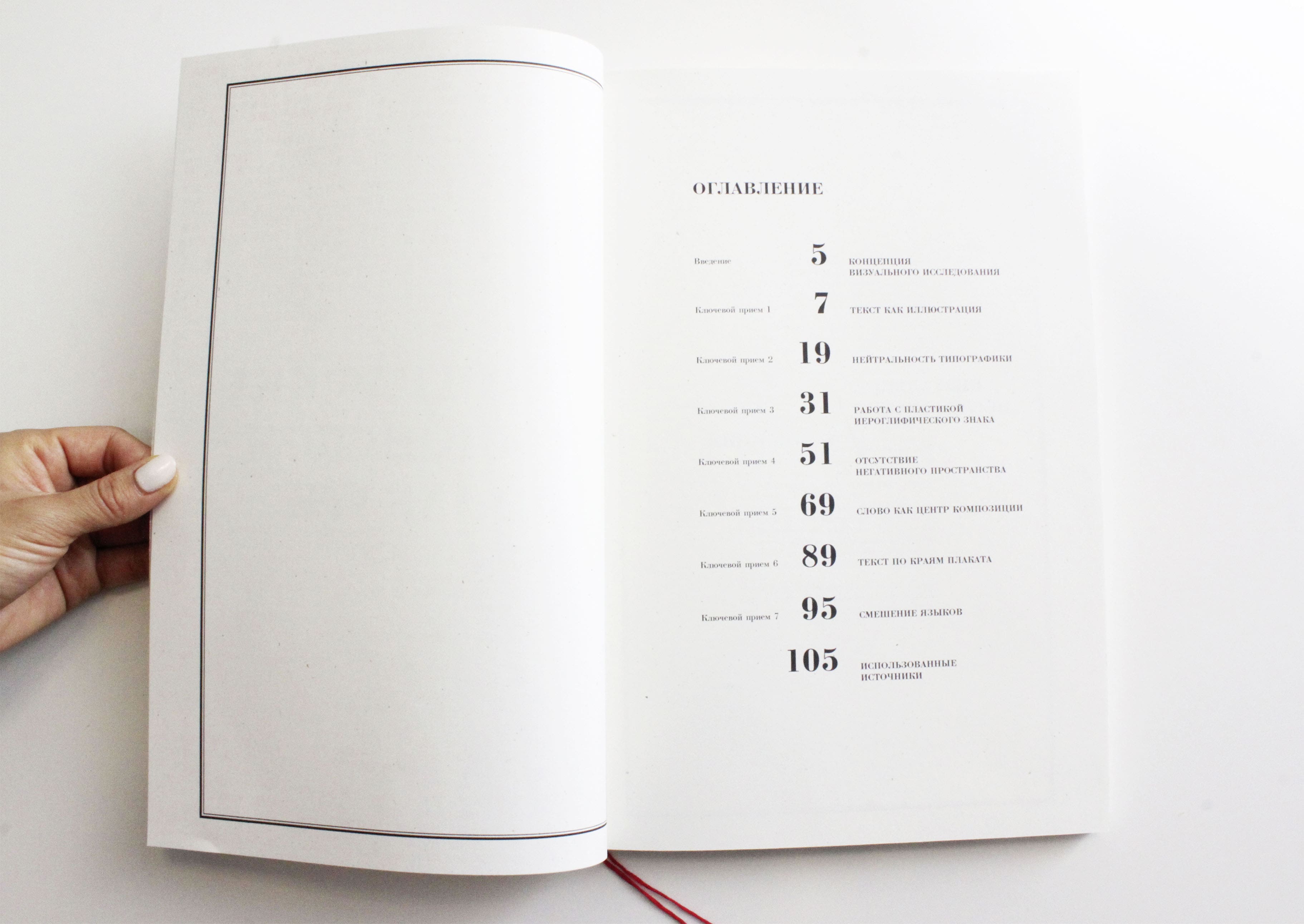
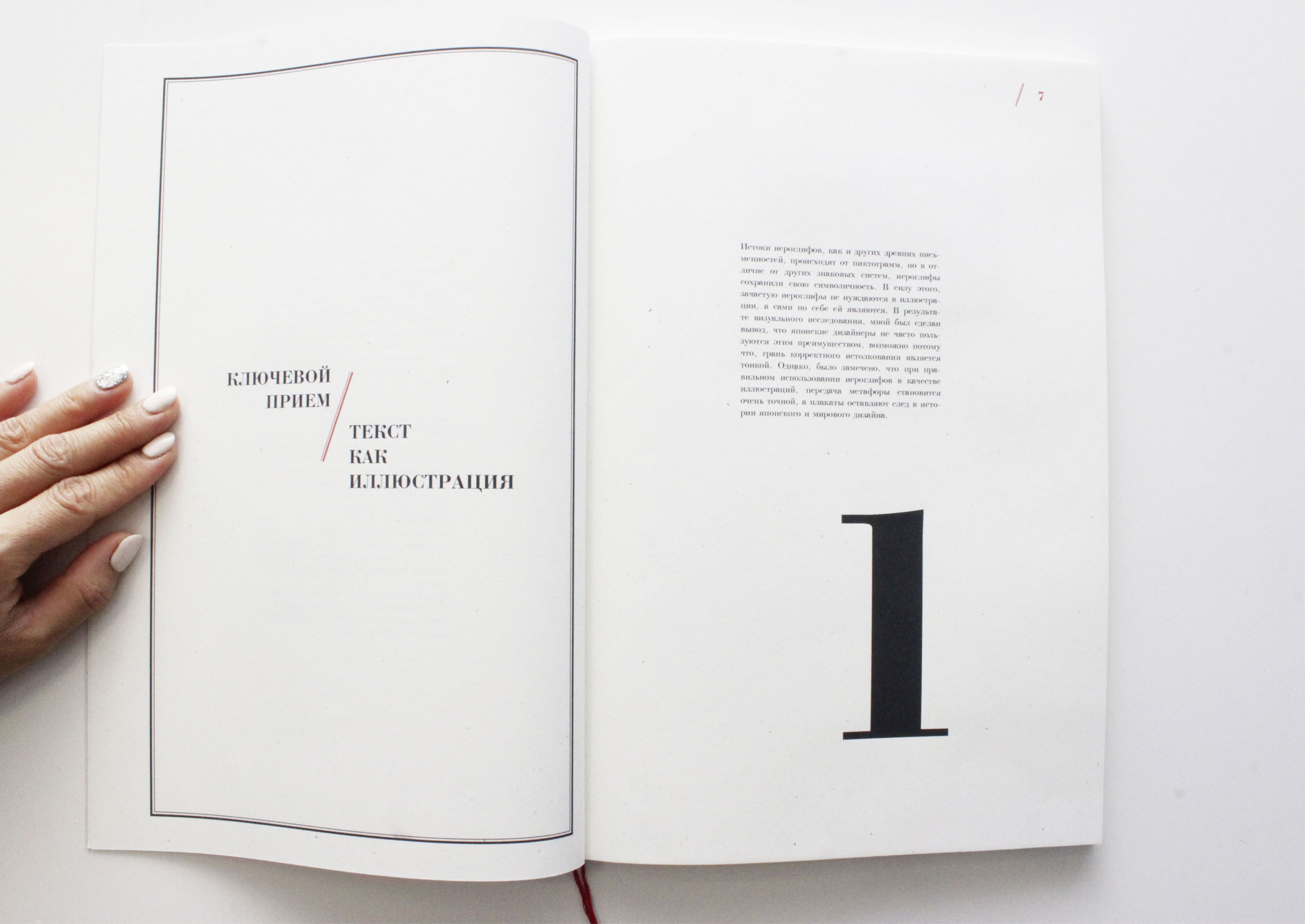
- Identifying six key principles Japanese designers use when working with typography.
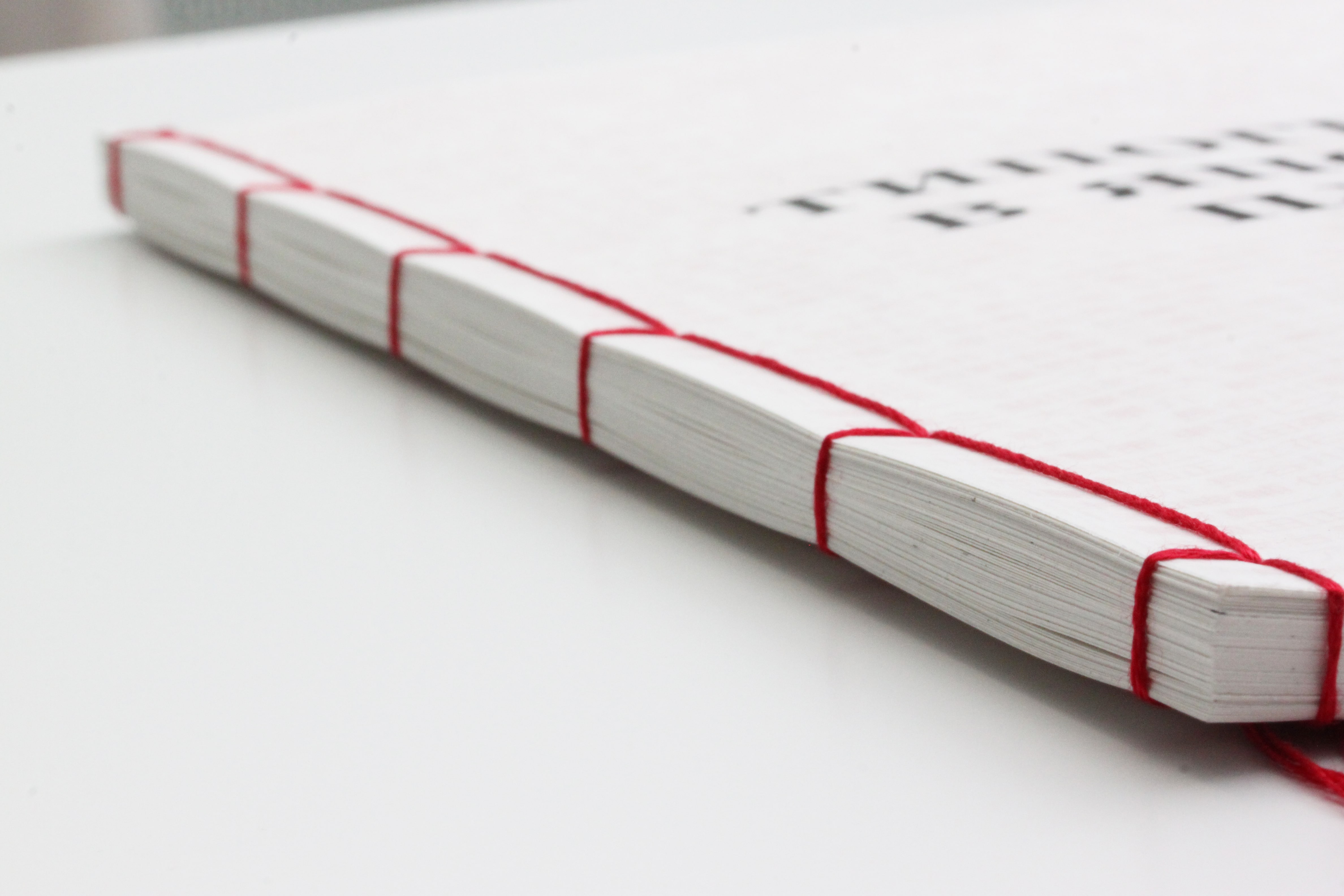
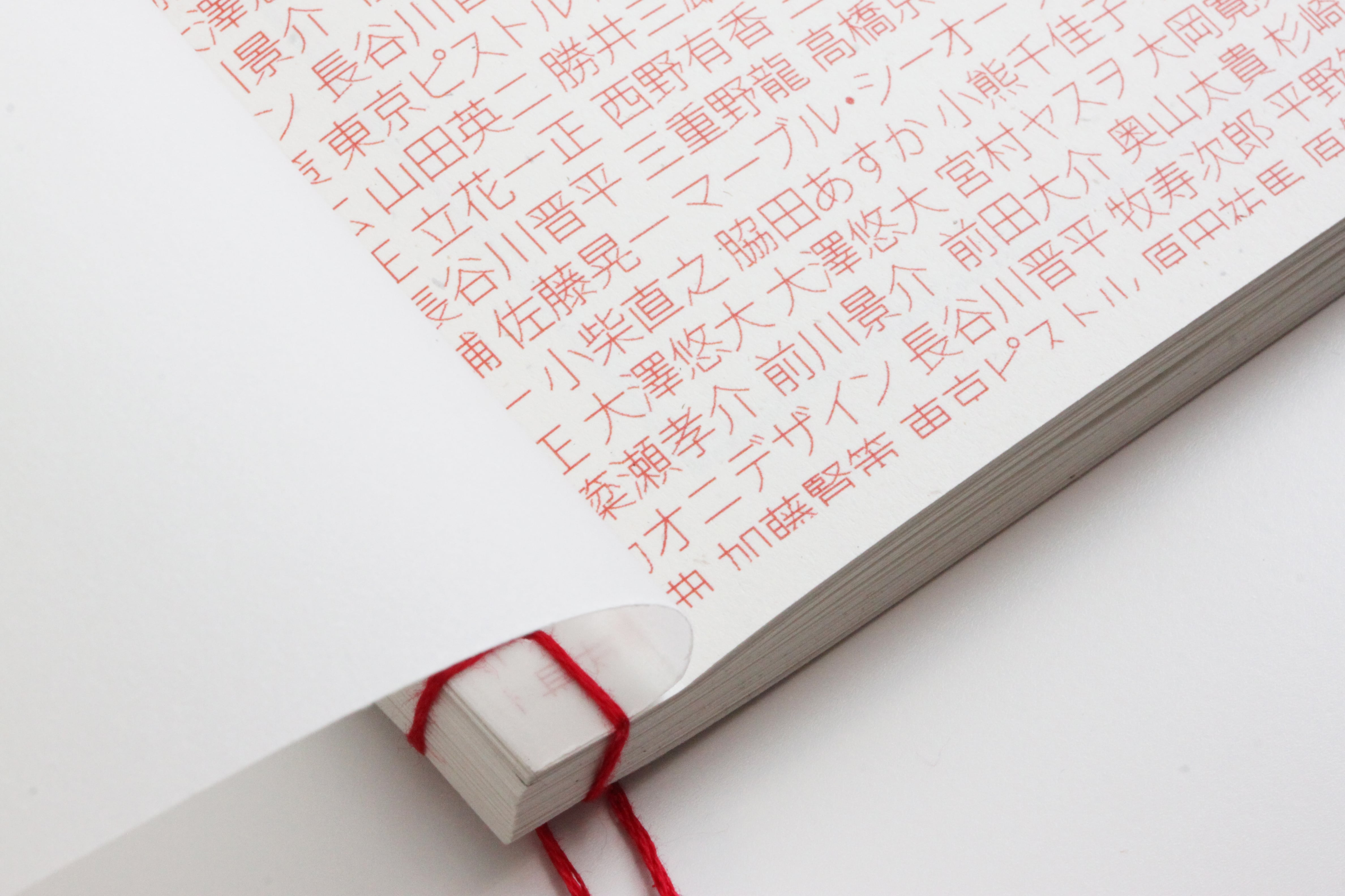
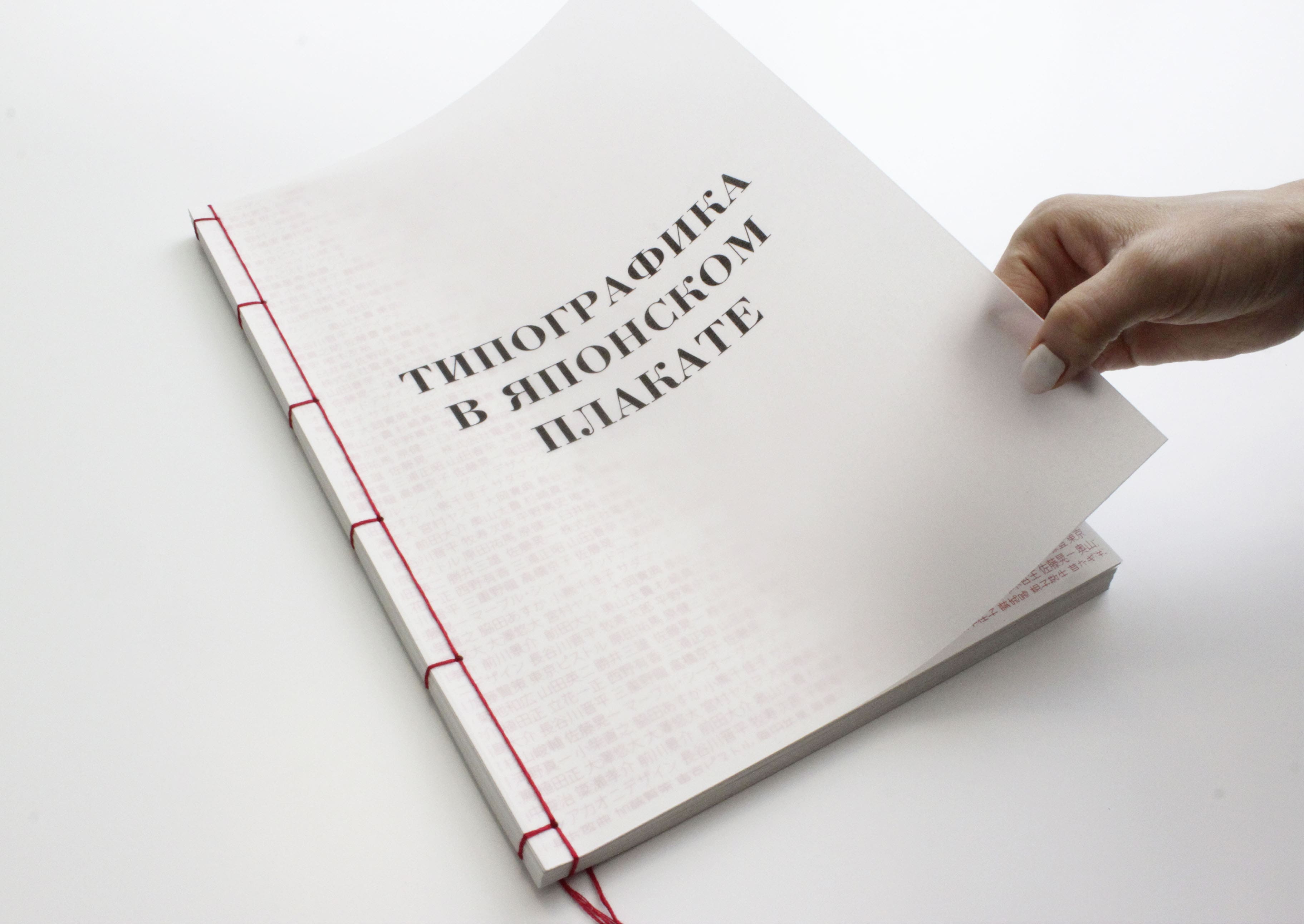
- Creating a book that encapsulates my findings.
- Successfully defending my Master’s thesis based on this research.
- Securing a prestigious grant from a Ishibashi Foundation & Japanese foundation to continue my research in Japan.
- Spending three months in Japan in 2022 interviewing experts in Japanese poster art.
You can find more details and insights from my research in English and Russian on my Medium blog.