UPLIFT Desk
Cart Page Redesign 2024
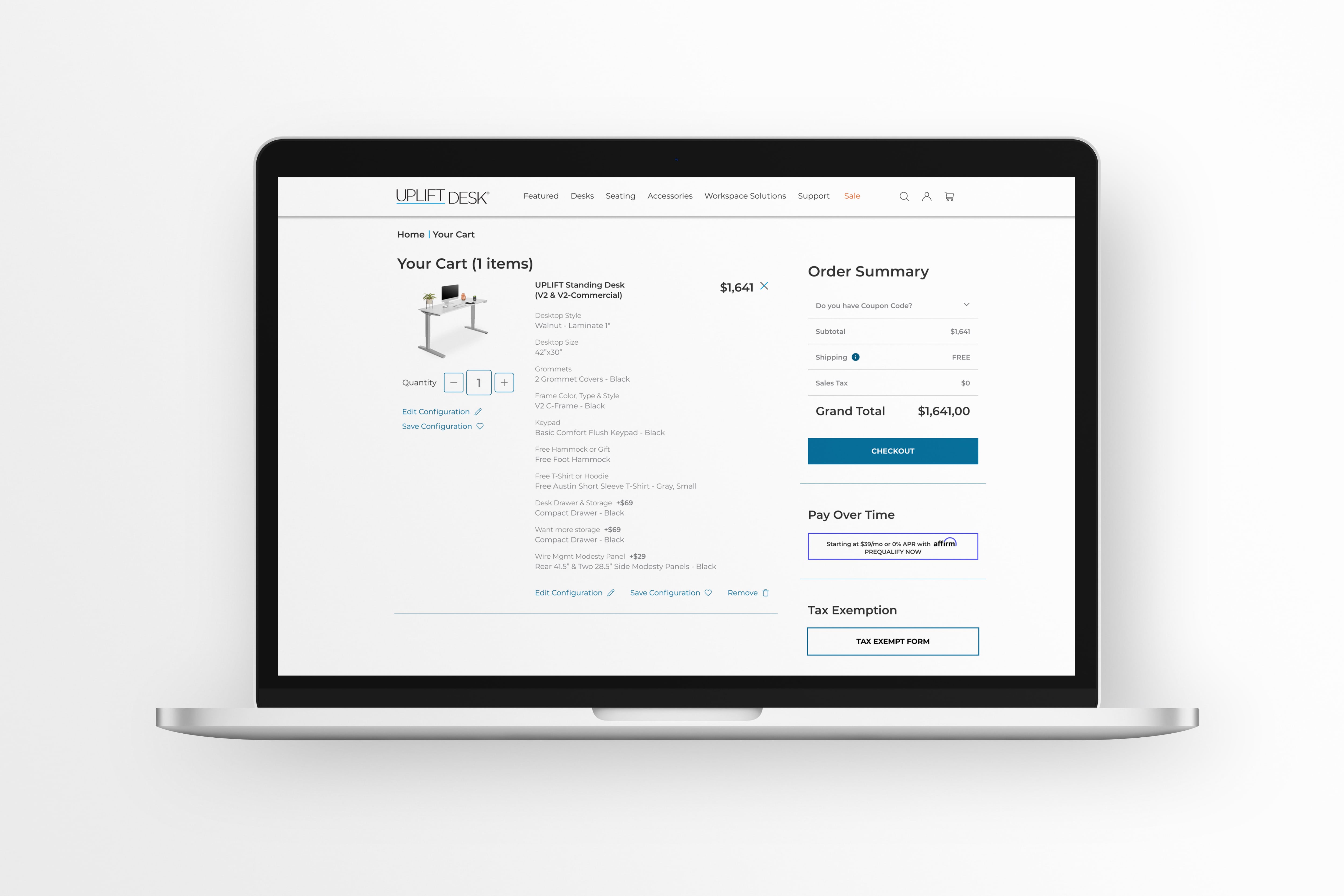
About the Project
A cart page redesign focuses on improving the user experience (UX), usability, and conversion rates of an e-commerce website’s cart page. The goal is to make the checkout process smoother, minimize friction, and enhance customer confidence in completing their purchase.
- Location - Austin, TX.
- Role - UI/UX Designer.
- Tools - Figma.
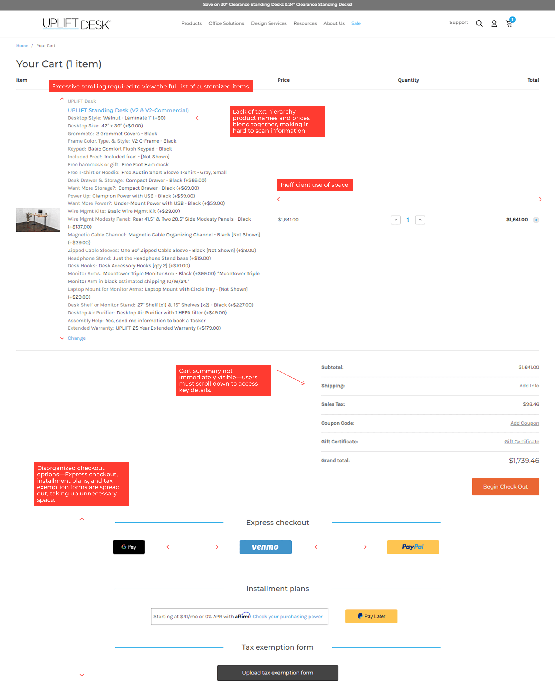
Problem Statement:
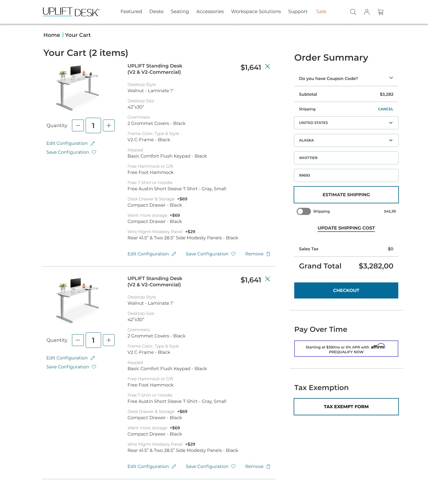
- Excessive scrolling required to view the full list of customized items.
- Lack of text hierarchy—product names and prices blend together, making it hard to scan information.
- Inefficient use of space—large gaps around pricing and quantity fields.
- Cart summary not immediately visible—users must scroll down to access key details.
- Disorganized checkout options—Express checkout, installment plans, and tax exemption forms are spread out, taking up unnecessary space.
“Before” Cart Page
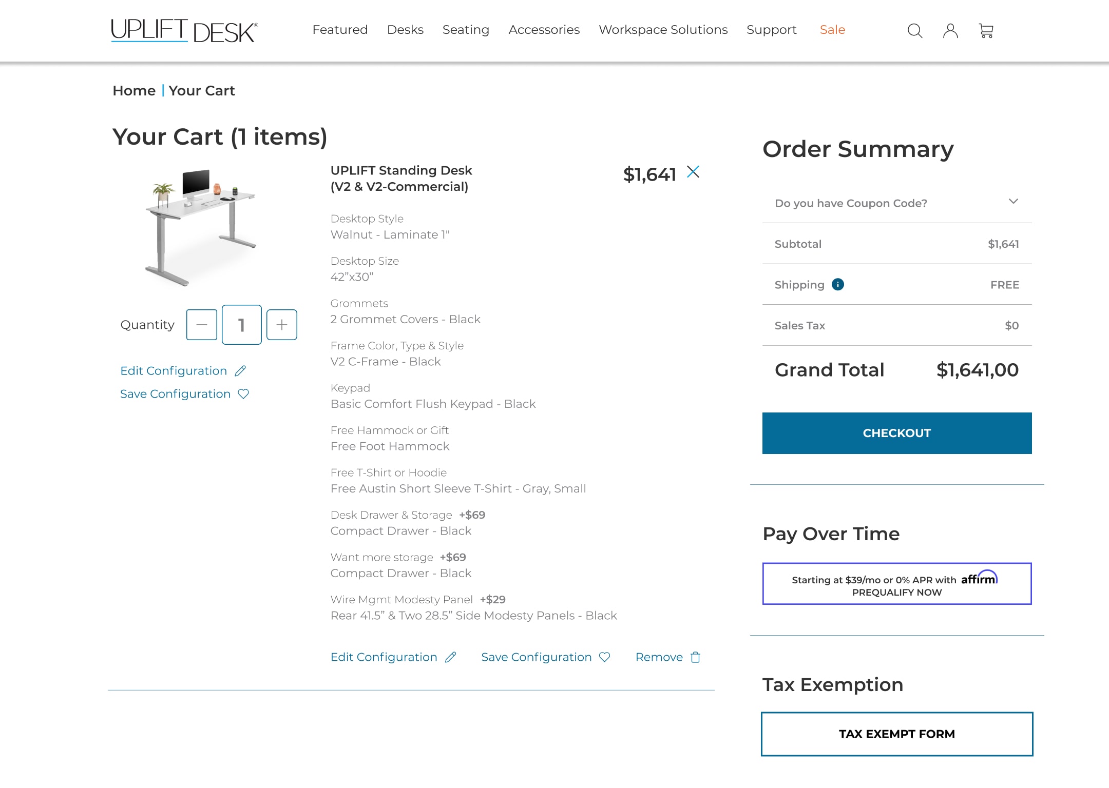
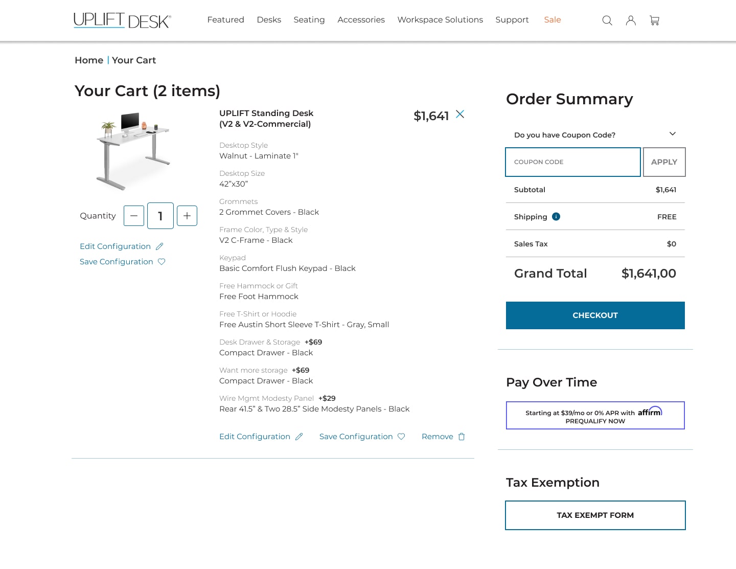
“After” Cart Page
Solutions:
- Optimized layout – Condensed product details to ensure all essential information fits on a single page without excessive scrolling.
- Improved text hierarchy – Used a single font with varied styles to emphasize key details, such as additional pricing.
- Enhanced accessibility – Introduced icons to improve visual clarity and navigation.
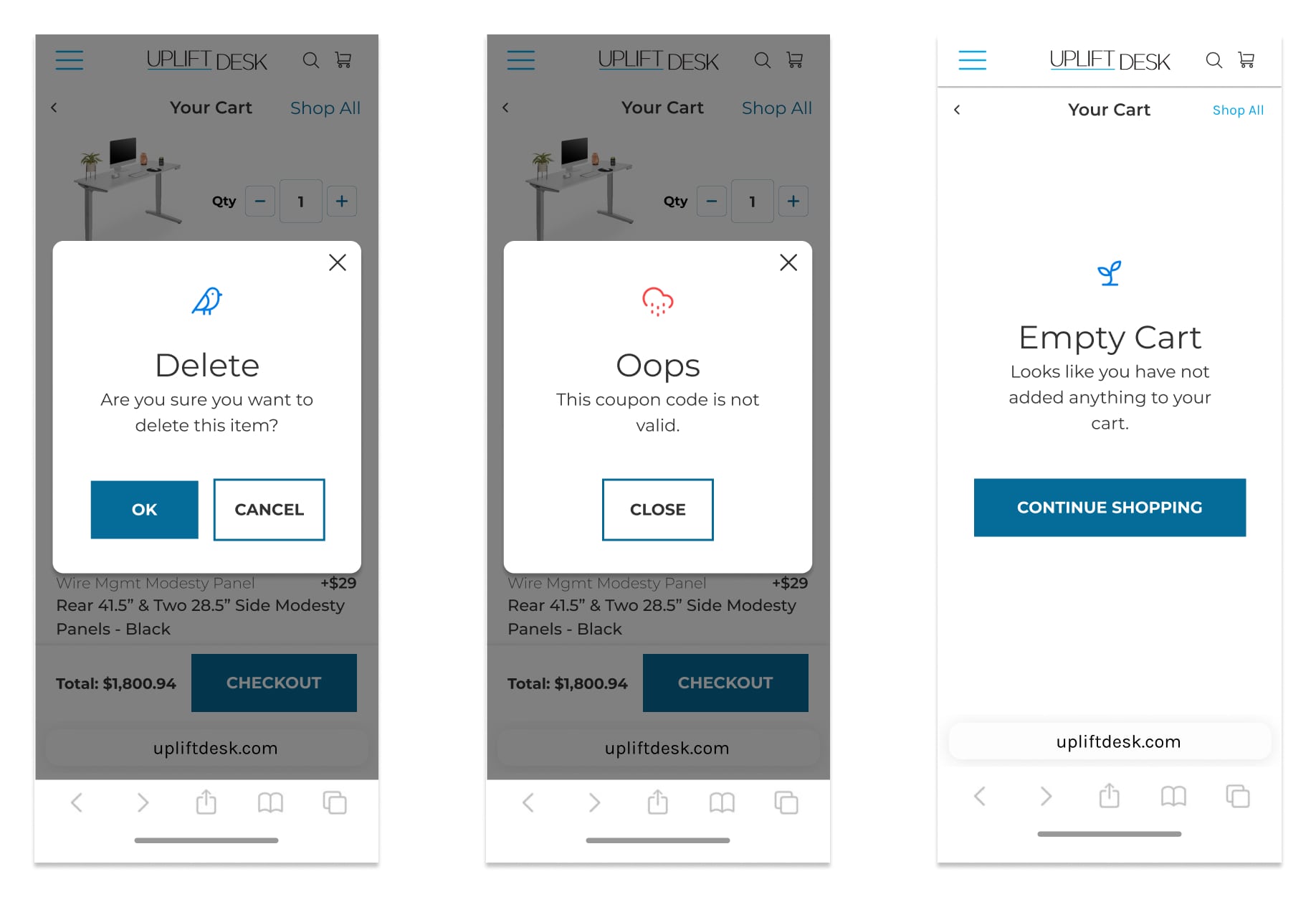
- Interactive elements & statuses – Added real-time updates and status indicators for a more intuitive user experience.
Outcomes:
- Reduced user scrolling by through streamlined design.
- Enhanced user satisfaction and task completion rates in usability testing.
By addressing the challenges of presenting complex product information, the redesigned cart page delivers a more organized, efficient, and user-friendly experience that aligns with customer needs.
Desktop
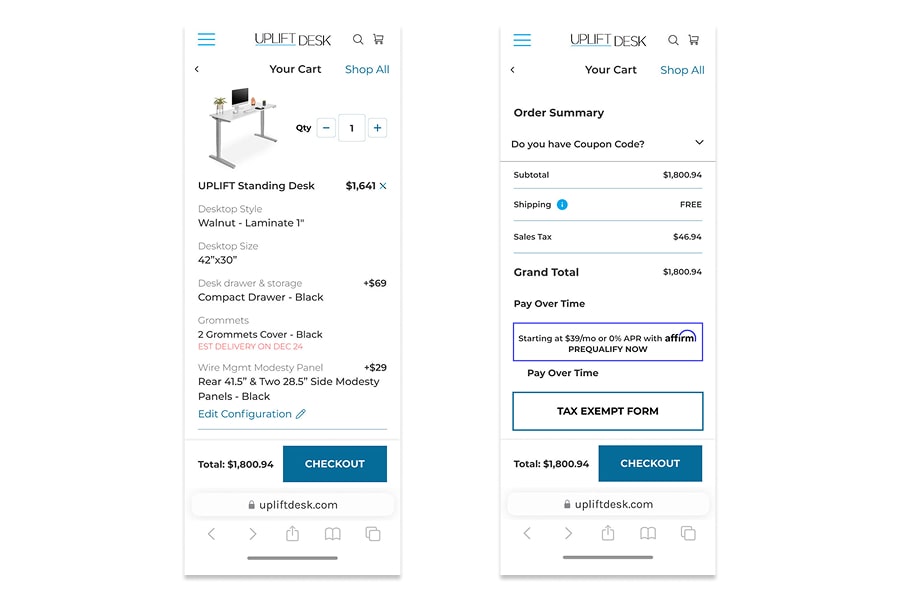
Mobile
Shipping Address Drop Down Menu
Coupon Code Drop Down Menu
Status Indicators
Components Library
