UPLIFT Desk
CTA buttons redesign
About the Project
Duration: 1 month (Dec – Jan 2025)
- Role - UX/UI Designer.
- Tools - Figma.
UPLIFT Desk aims to establish a consistent UI system, focusing on improving Call-to-Action (CTA) buttons. The current design lacks visual prominence, consistent text style, accessible colors, and uniform button shapes and states, leading to confusion and reduced conversions. The proposed solution includes bold, solid-colored primary buttons, standardized text style, accessible color schemes, consistent button shapes, and clear button states with animations to enhance user experience and conversions.
What Are Call-to-Action (CTA) and Why Do They Matter
Buttons are interactive elements that, when clicked, trigger a desired action. They are essential for guiding users through the customer journey, from product exploration to checkout.
In digital marketing, buttons are often used as CTAs (Calls to Action) to encourage specific behaviors, such as signing up for a newsletter, downloading a resource, or making a purchase.
Why Accessibility + Design Matter
Buttons and links are crucial for conversions.
Poor contrast, inconsistent styles, and inaccessible elements alienate users and reduce revenue potential.
Your customer lands on your site, wallet in hand, ready to buy. Every second they pause to figure something out is a second closer to them leaving. Your Mission Eliminate friction. Simplify every interaction.
- Buttons must command attention, clearly convey action with intuitive labels and placements.
- Links must have an instantly recognizable purpose. Descriptive text, ambiguity kills conversion.
- Headings are wayfinders. Structure them to prioritize clarity & hierarchy (leverage UX + SEO).
Think of your website as a high-performance machine.
Every extra click, confusing element, or inaccessible design? It’s sand in the gears.
UPLIFT Desk vs Competitors Research
Problems Identified Through Visual Research
- Primary Buttons Design: Our primary buttons differ from competitors, who predominantly use filled, contained buttons with bold color fills, making their CTAs more visually prominent.
- Text Style Inconsistency: Text styles vary across CTAs (UPPER CASE, Sentence case, Title Case), while competitors maintain consistent styling, reinforcing clarity and brand identity.
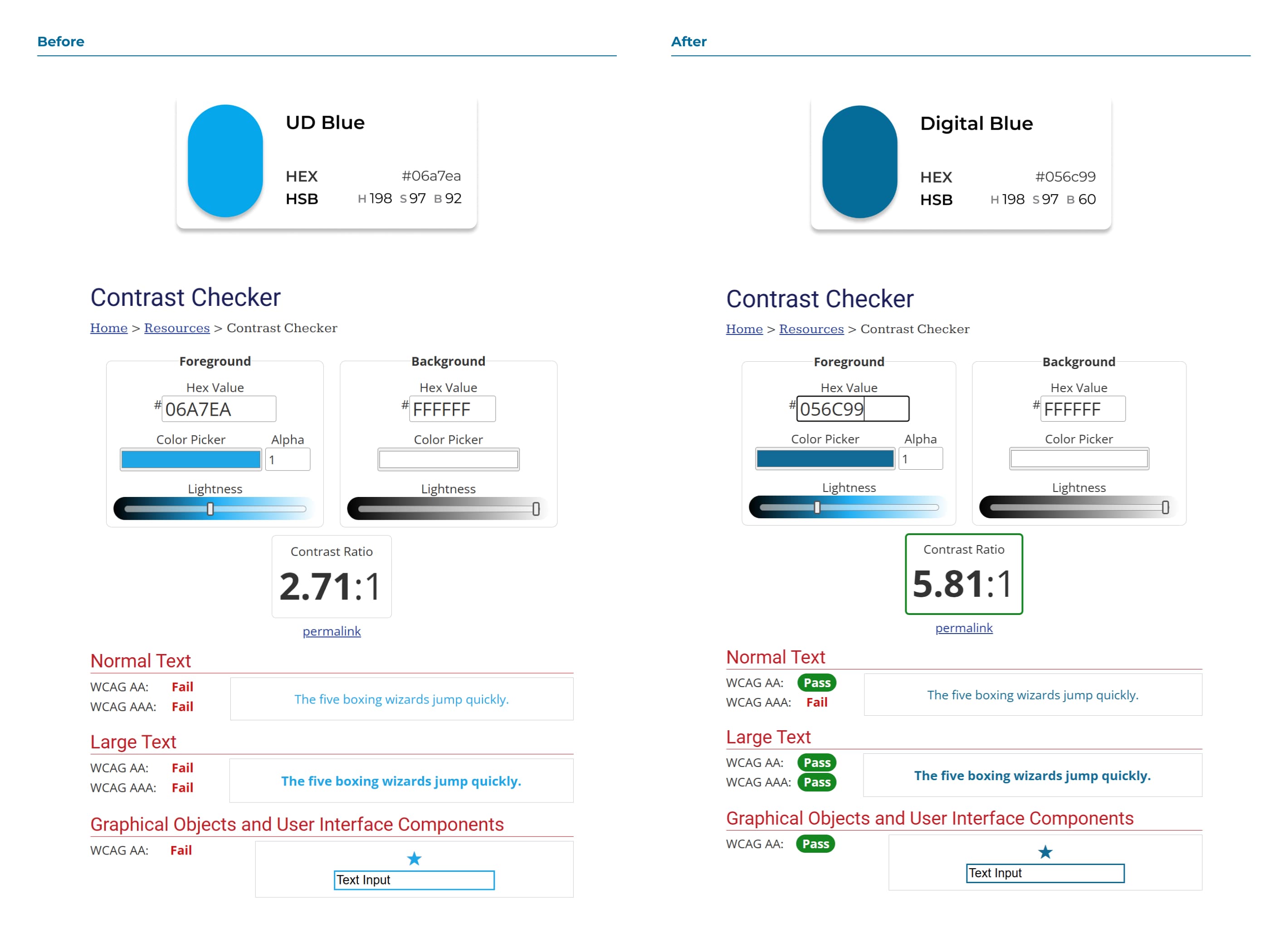
- Color Issues: Key colors, such as UPLIFT Desk Blue (#06a7ea), fail accessibility standards (contrast ratio 2.7:1, target 4.5:1), reducing usability for users with visual impairments. We use a mix of colors, while competitors rely on a consistent, solid color palette to strengthen their visual identity.
- Mixed Button Styles: CTAs feature inconsistent shapes, with some buttons having sharp corners and others soft edges, leading to a disjointed look.
- Inconsistent Button States: Button states lack uniform styling, which can confuse users instead of guiding them through actions.
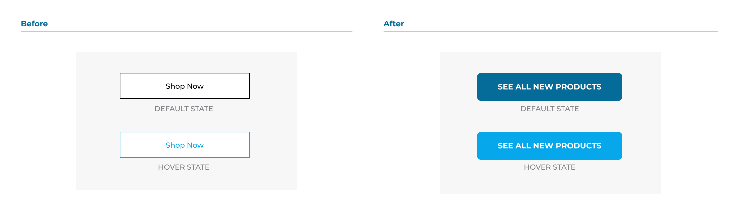
1. Primary Button Design
Problem
The primary CTA is not visually prominent. Unlike our competitors, it lacks a solid fill color, making it less noticeable. On hover, it becomes even less prominent when it should ideally stand out more.
Why it’s problem
For Conversions: A weak primary CTA fails to grab attention, reducing engagement and click-through rates.
For User Experience: Users may overlook the primary action, causing confusion and creating friction in navigation.
Solution
The new design makes the primary button stand out with a bolder appearance and distinct, consistent states to emphasize its importance. Enhancing the primary CTA’s design with a bold, solid fill and a standout hover state will improve visibility and usability, driving better results.
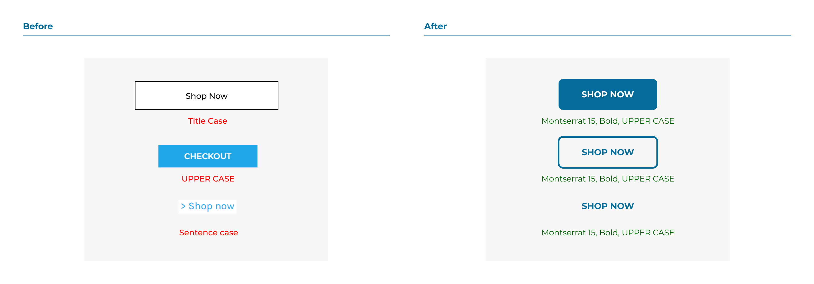
2. Text Style Inconsistency
Problem
CTA text varies in font weight, size, and style (ALL CAPS, Sentence case, Title Case), making the overall design feel fragmented.
Why it’s problem
For Conversions: Inconsistent typography weakens brand identity and reduces the visual hierarchy, making CTAs less compelling. For User Experience: Users struggle to recognize buttons as part of the same interface, increasing cognitive load.
Solution
The new design makes the primary button stand out with a bolder appearance and distinct, consistent states to emphasize its importance.
What did we do
Font Style: Now we have a single font family Montserrat.
Case Style: Standardized UPPER CASE style.
Font Weight and Size: Consistent font weight - Bold and size (e.g., 15px) for all CTAs to reinforce visual harmony (except special button).
This consistency will enhance readability, create a unified brand identity, and provide a seamless user experience.
3. Color Issue
Problem
CTA colors lack a unified logic, even within the existing color library.
Key colors like UPLIFT Desk Blue (#06a7ea) fail accessibility standards (contrast ratio 2.7:1, target 4.5:1). Footer links and links on dark backgrounds lack defined states.
Why it’s problem
For Conversions: Poor color contrast makes CTAs less noticeable and harder to interact with, reducing engagement.
For User Experience: Inconsistent and inaccessible colors hinder usability and alienate users with visual impairments.
Solution
The new design adopts #056C99, which meets accessibility standards while maintaining brand alignment.
New color scheme defines clear default, hover, disabled, focus, and visited states for links in all contexts (e.g., footer, dark backgrounds).
Case Style: Standardized UPPER CASE style.
Font Weight and Size: Consistent font weight - Bold and size (e.g., 15px) for all CTAs to reinforce visual harmony (except special button).
This consistency will enhance readability, create a unified brand identity, and provide a seamless user experience.
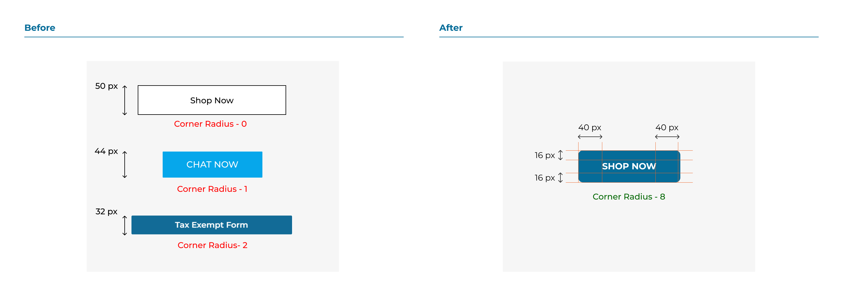
4. Inconsistent Button Design
Problem
Button sizes, padding, and styles vary significantly across the site. Some buttons are taller or wider than others due to inconsistent padding, while others feature mixed shapes, with sharp corners on some and soft edges on others. These inconsistencies disrupt the cohesive design and create a disjointed user experience.
Why it’s problem
For Conversions: Lack of a consistent button shape reduces user recognition of actionable elements.
For User Experience: A disjointed design undermines brand coherence and professionalism.
Solution
The new design have standardized sizes and padding.
New style adopts a single corner style—either sharp or rounded—for all buttons to create visual consistency and alignment with the brand’s design language.
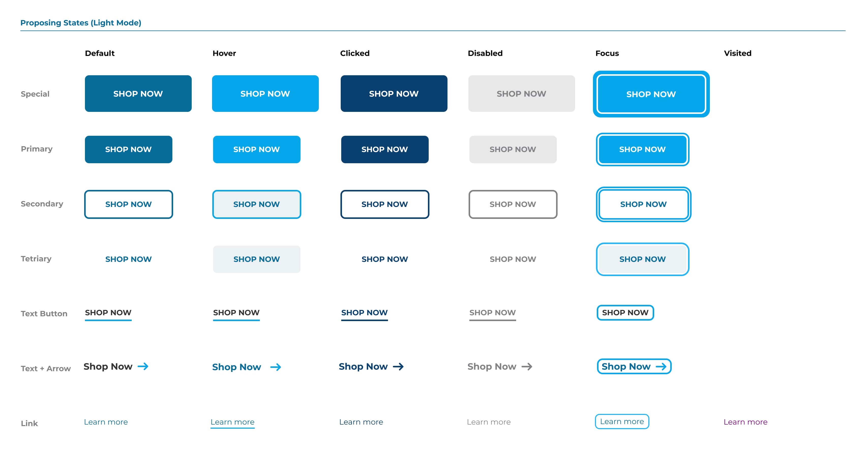
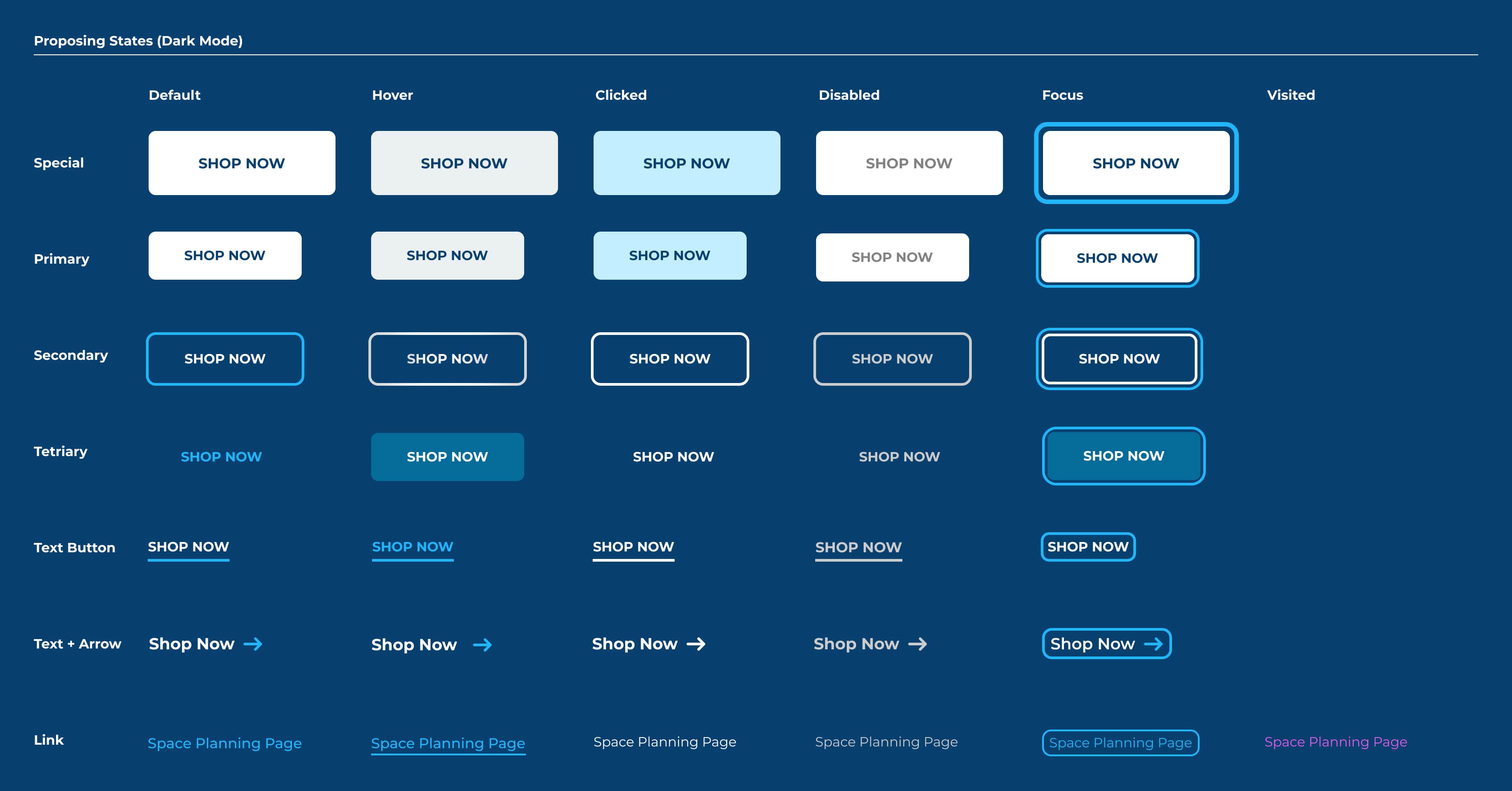
5. Button States
Problem
Button states lack consistent styling, leading to user confusion instead of clarifying actions.
Why it’s problem
For Conversions: Unclear states make interactions feel unpredictable, discouraging user engagement.
For User Experience: Inconsistent states disrupt the flow, making it harder for users to understand what’s clickable or actionable.
Solution
Implement a consistent design for all button states (default, hover, disabled, focus, etc.) with clear animations to enhance interactivity and guide user actions effectively.
Animation Storyboard
Reasoning
Animation in CTAs (Call-to-Action buttons) serves multiple purposes, enhancing both functionality and user experience. Here’s why animation can be beneficial, and here is why:
What it is helping with
- Drawing Attention: Drawing Attention. Animation helps a CTA stand out from static elements on a page. It subtly attracts the user’s eye without being overly intrusive.
- Encouraging Interactivity: Motion creates a sense of responsiveness, inviting users to engage.
- Communicating Functionality: Animation can visually guide users on what to do or what will happen after clicking.
- Creating a Memorable Experience: Thoughtfully designed animations enhance the overall aesthetic, leaving a positive impression.
- Reinforcing Brand Identity: Unique animations can align with a brand’s personality and values, making CTAs more recognizable.
- Guiding the User Journey: Animations can emphasize the next step in the process.ons effectively.