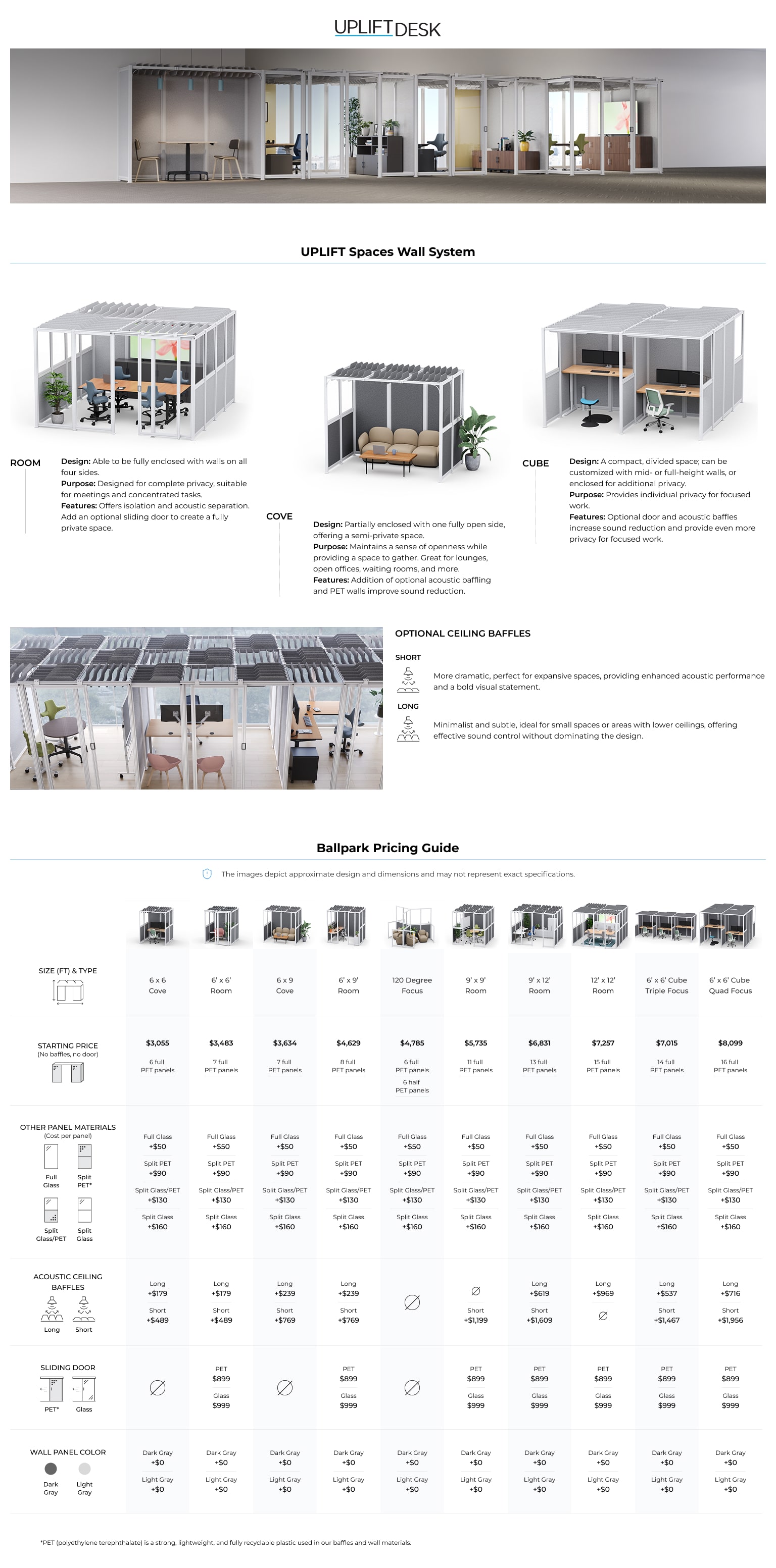
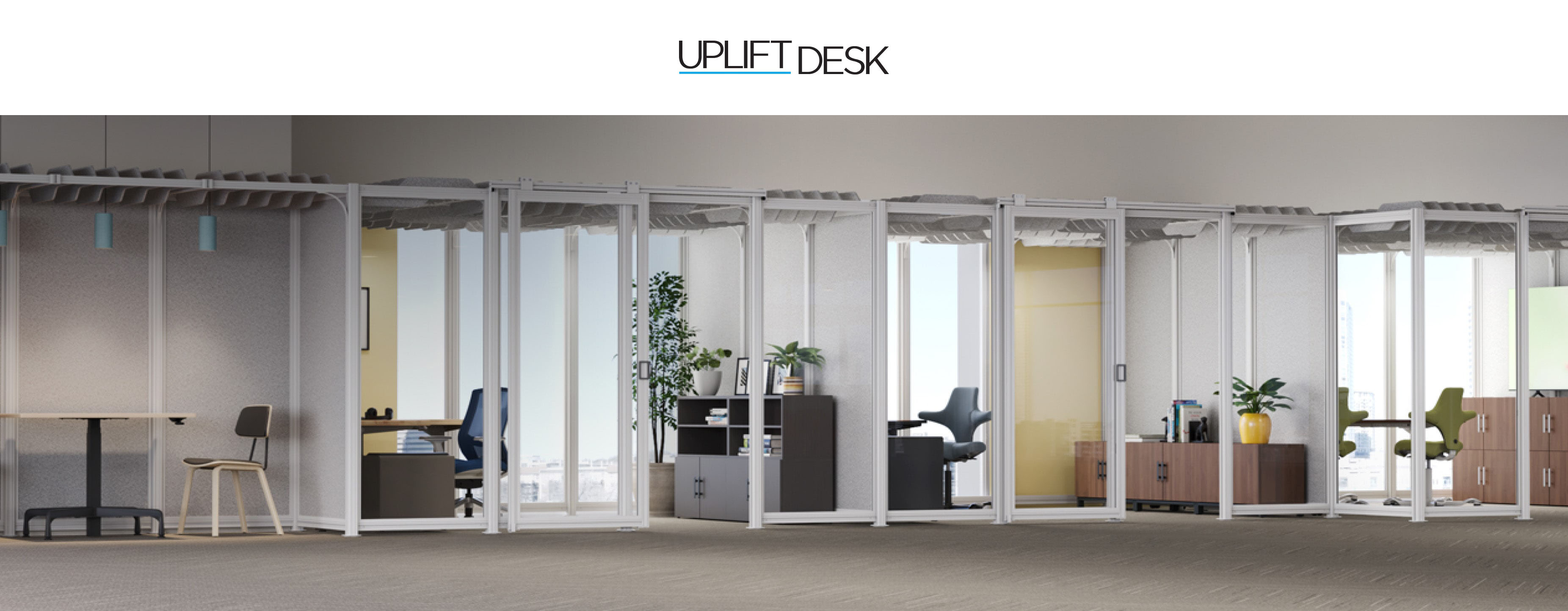
UPLIFT Desk
Simplifying Pricing: A UX Approach to the Wall Spaces Pricing Guide
About the Project
Simplifying Pricing: A UX Approach to the Wall Spaces Pricing Guide.
- Location - Austin, TX.
- Role - Digital Designer.
- Tools - Figma, Illustrator.
Problem Statement
As a new and unique addition to our line of office furniture products, UPLIFT Wall Spaces lacked a dedicated pricing guide. While other products had pricing documents, they took a different approach—often long, information-heavy, and visually complex, making them difficult for customers to navigate. Finding and comparing prices required sifting through multiple pages, leading to frustration and confusion.
To address this, I decided to take a UX-driven approach to the pricing guide. Instead of simply listing prices, my focus was on usability, clarity, and accessibility—ensuring that customers could quickly understand their options without cognitive overload. This meant prioritizing clear information hierarchy, intuitive visual design, and a streamlined layout to make pricing easy to digest at a glance.
For the whole work process scroll file below.
Information Architecture & Low Fidelity Designs
- Understanding the Product – I studied 3D renders to familiarize myself with the product’s structure and customization options.
- Analyzing Pricing Data – I reviewed multiple pricing spreadsheets to identify key cost variables and ensure all options were accurately represented.
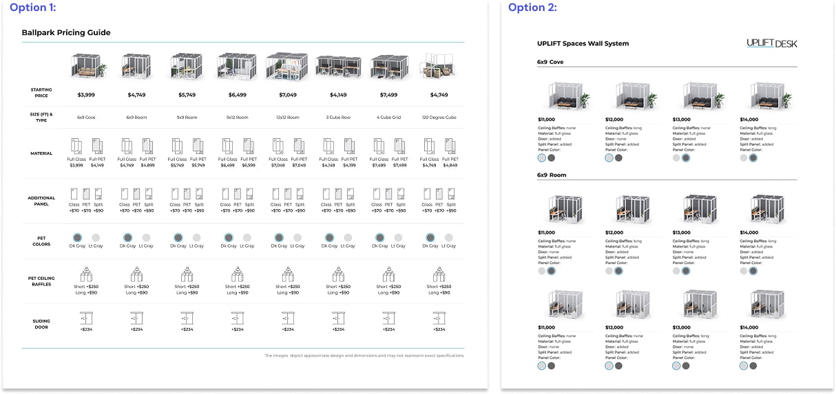
- Exploring Presentation Formats – I developed two mid-fidelity prototypes to determine the most effective way to present pricing information:
- Option 1: A single-page list consolidating all products for quick and easy comparison.
- Option 2: A categorized layout that grouped products into sections with an individualized pricing approach.
Content Strategy
After evaluating both options with the project coordinator we chose Option 1—a single-page format that allows customers to compare all products at a glance. This decision was driven by its ability to simplify decision-making, reduce navigation friction, and present pricing in a transparent, easy-to-digest manner.
Visual Design
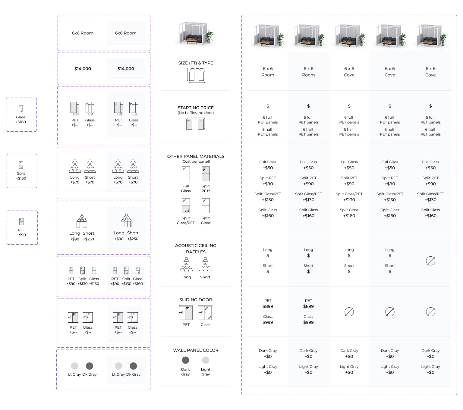
Icons & Descriptions: I designed set of clean, minimalistic icons paired with concise descriptions to visually explain key product attributes, such as material, color, and construction details.
Modular Text Components: I implemented structured text components to ensure consistency and make it easier to update the document’s visual style efficiently, without requiring manual adjustments to each element.
![]()

Outcome & Impact
The new approach to the pricing guide, refined through multiple iterations, transformed a once complex process into a clear, intuitive, and user-friendly document. Customers can now quickly access the information they need, easily compare options, and make confident purchasing decisions with minimal effort.